Bringing Typography to Life: Highlights from ATypI Brisbane & SPAM Container Debut

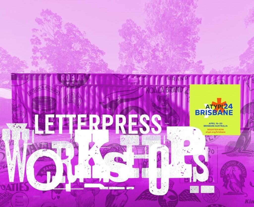
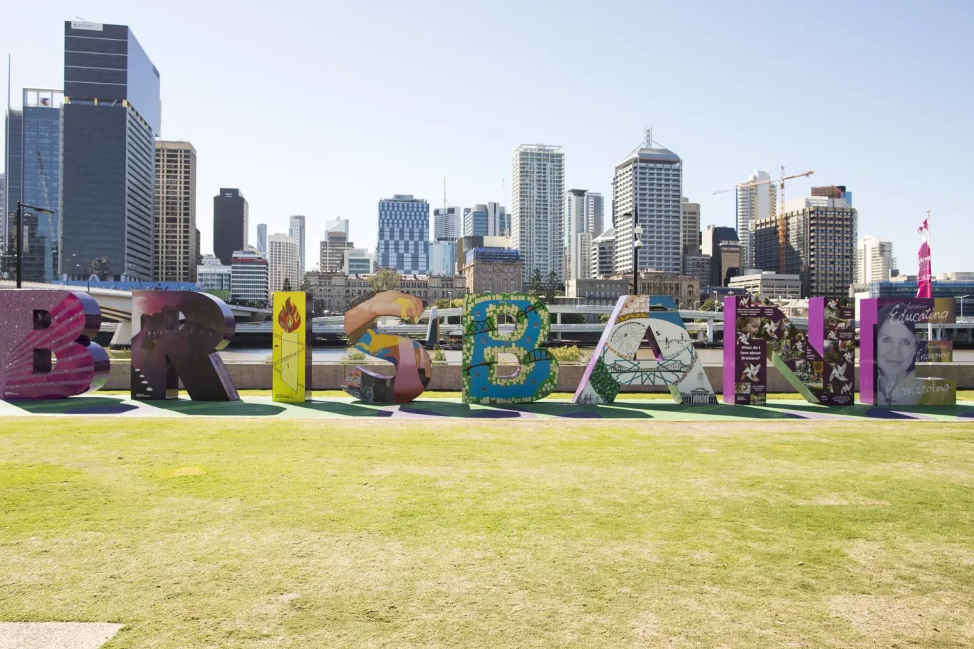
The recent ATypI Brisbane conference marked a milestone for typography enthusiasts across the globe. With a lineup boasting nearly 70 speakers and an array of workshops, the event was a celebration of the art and craft of type design. Held at the Brisbane Convention and Exhibition Centre from April 16 to 20, 2024, it was the first time the conference graced Australian shores, demonstrating the growing reach of the global type community.

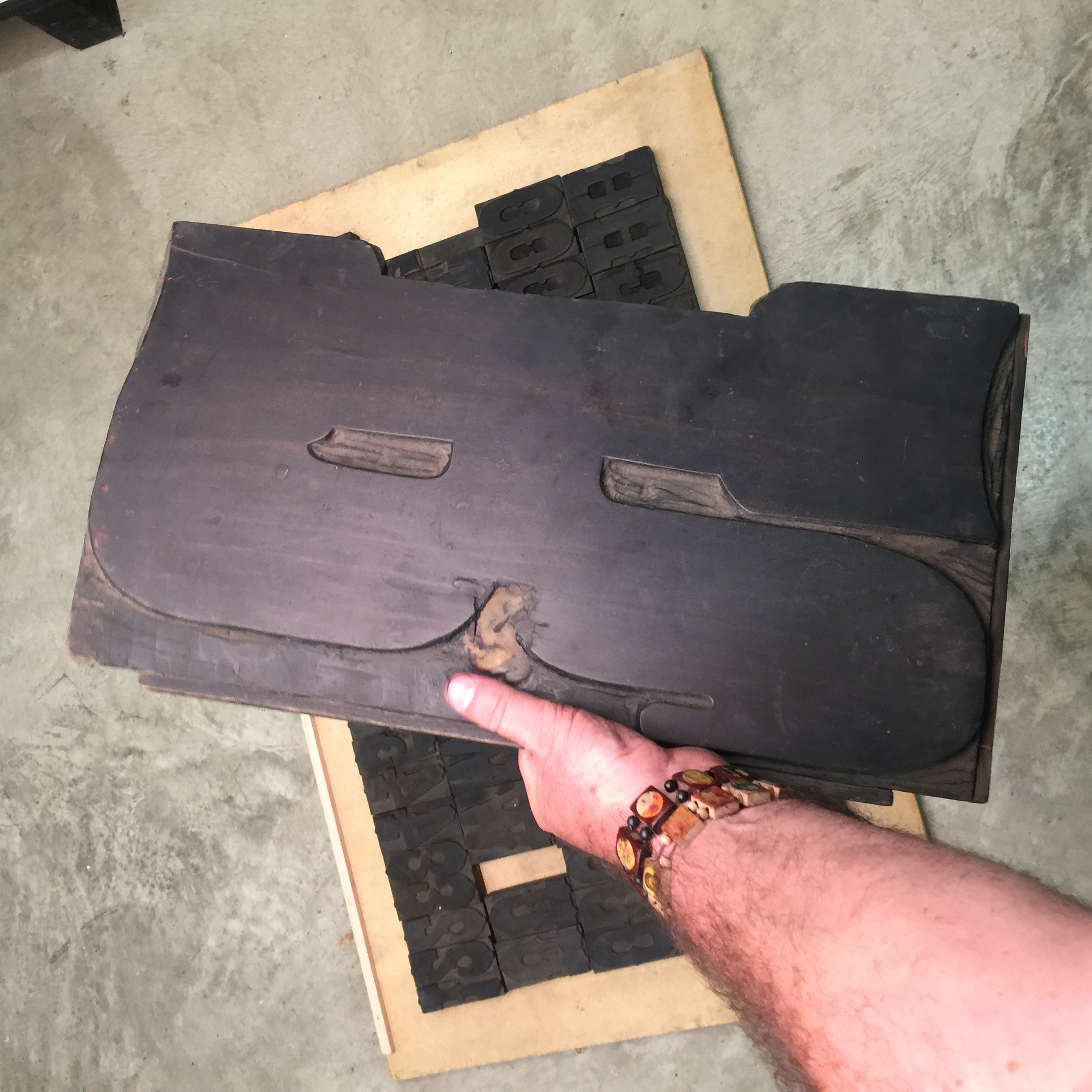
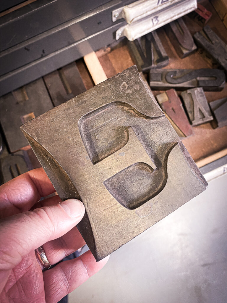
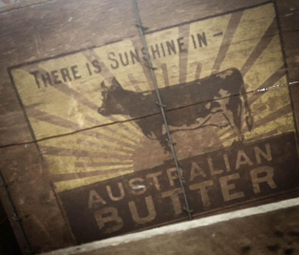
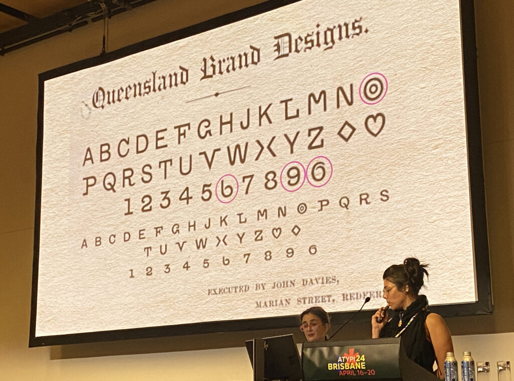
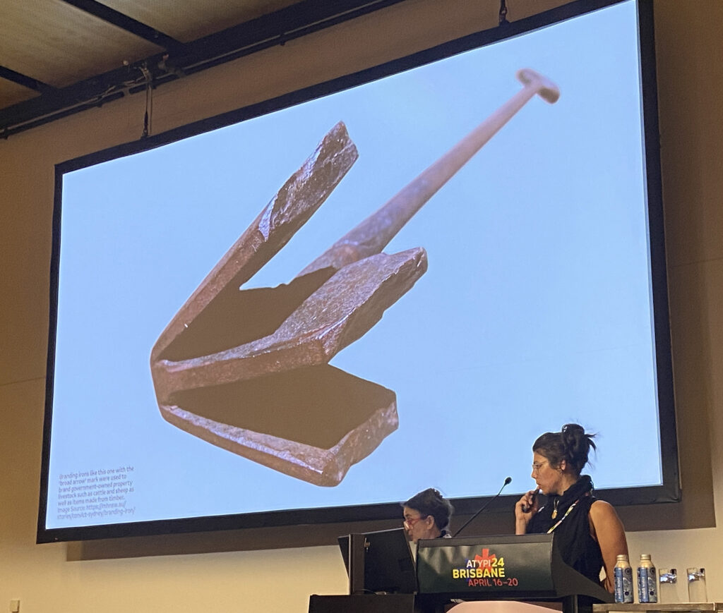
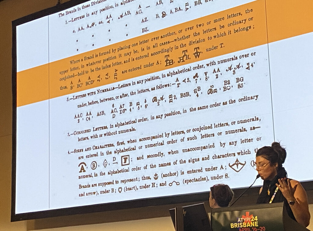
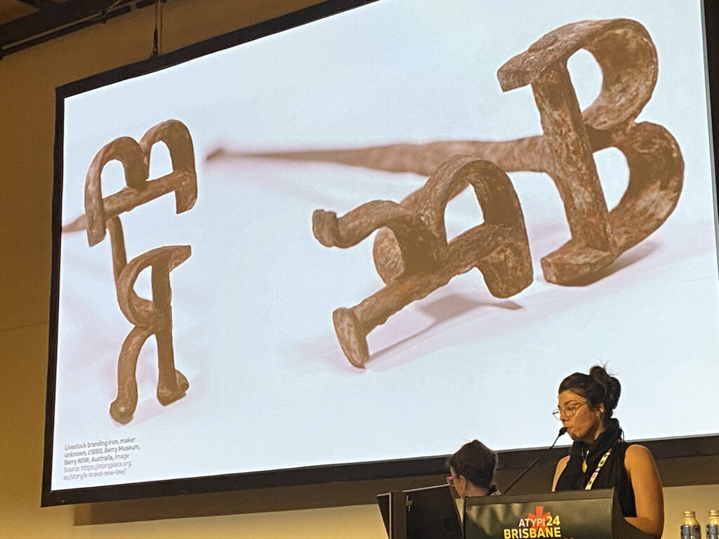
One memorable moment from the conference was the captivating presentation Bovine Pyroglyphics by Dzintra Menesis and Dr. Melissa Silk. The presentation explored the history of the 1872 Brands Act in Australia, which mandated branding for livestock ownership. It discussed how this necessity led to the creation of unique cattle brands with unconventional letter shapes, defying traditional typography rules. Queensland Brand Designs emerged as a result, blending cultural crafting with colonial necessity. The presentation contextualised the significance of these brands and their reinterpretation in the digital age, showcased in the Branding Irons and Blockchains workshop hosted buy your truly and assisted by my good friend and international type designer Troy Leinster.

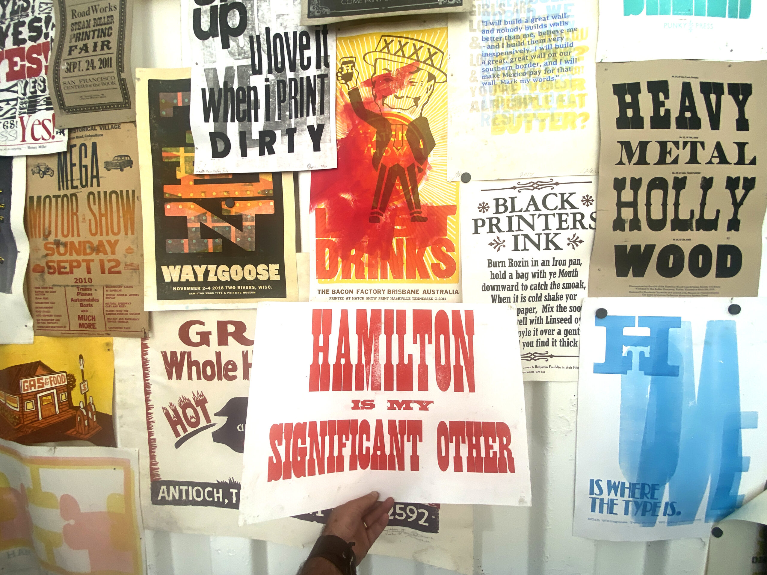
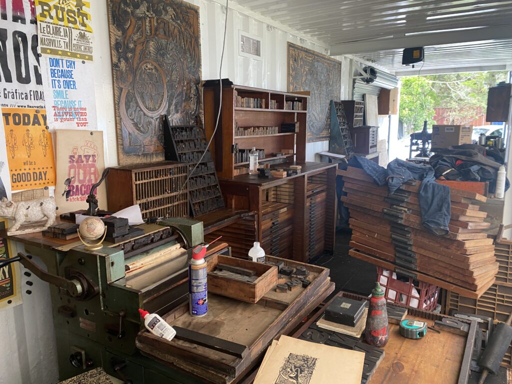
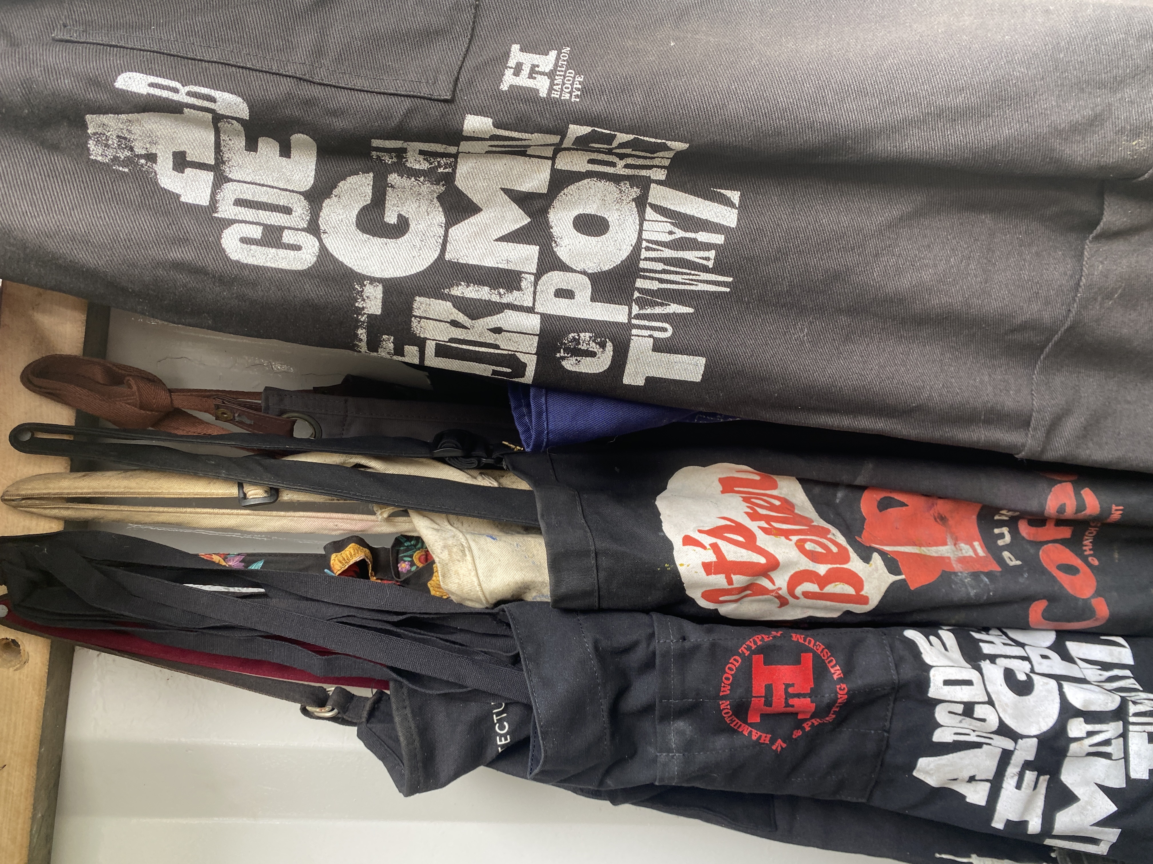
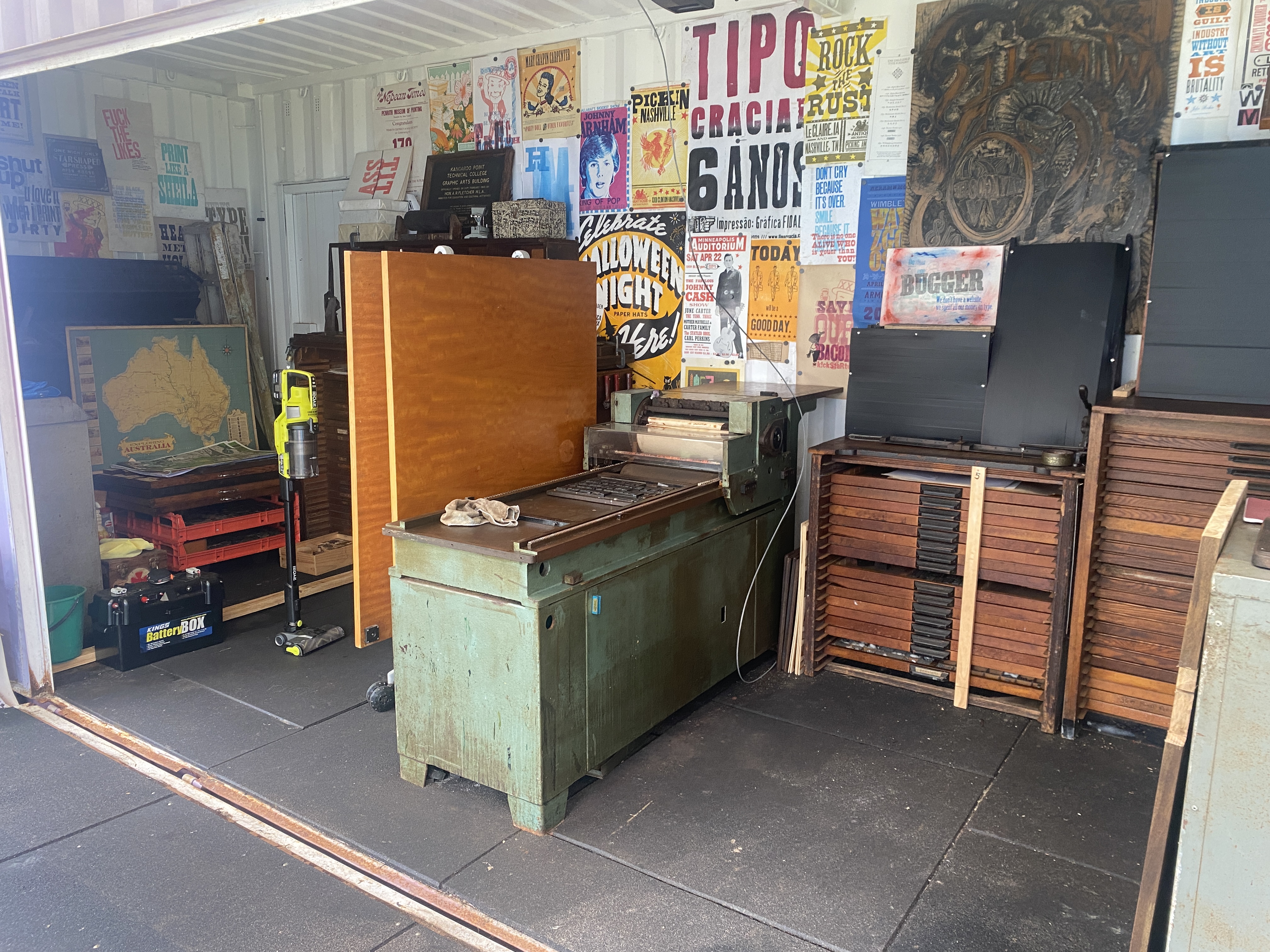
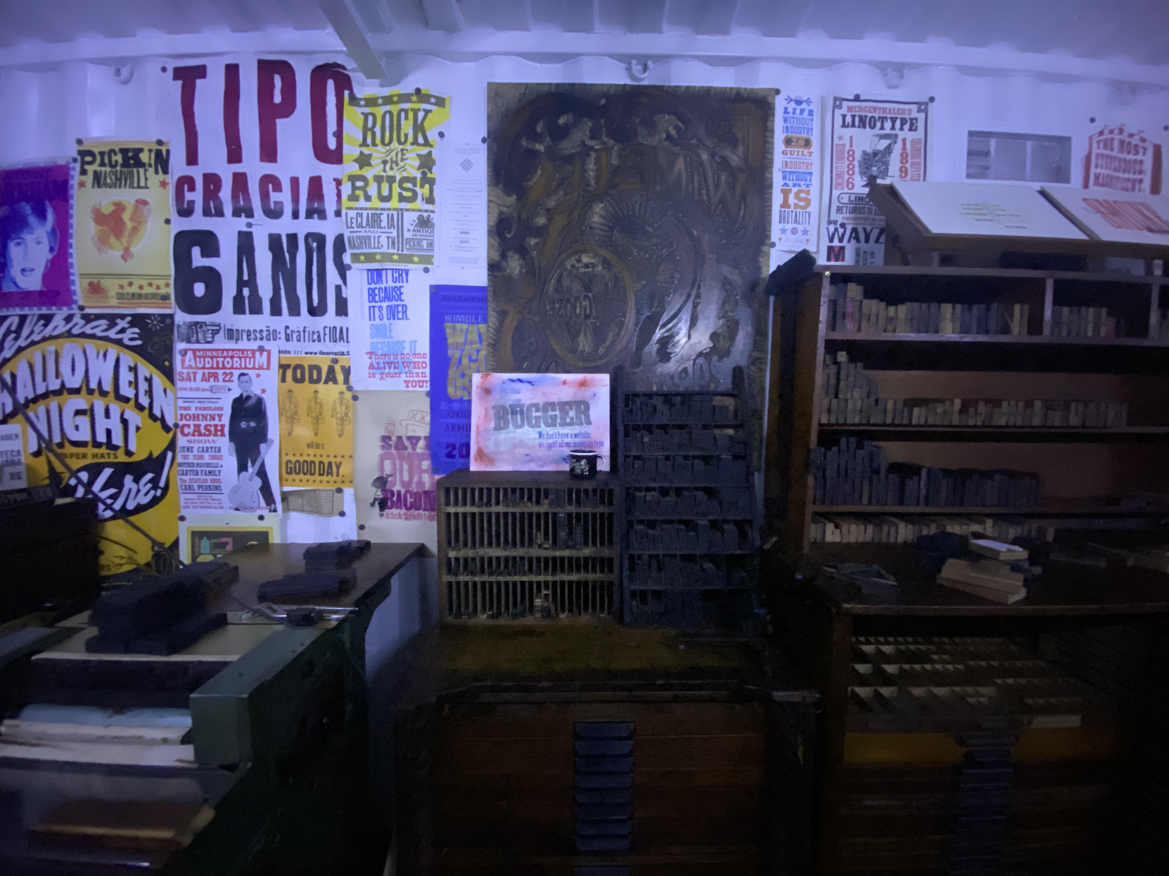
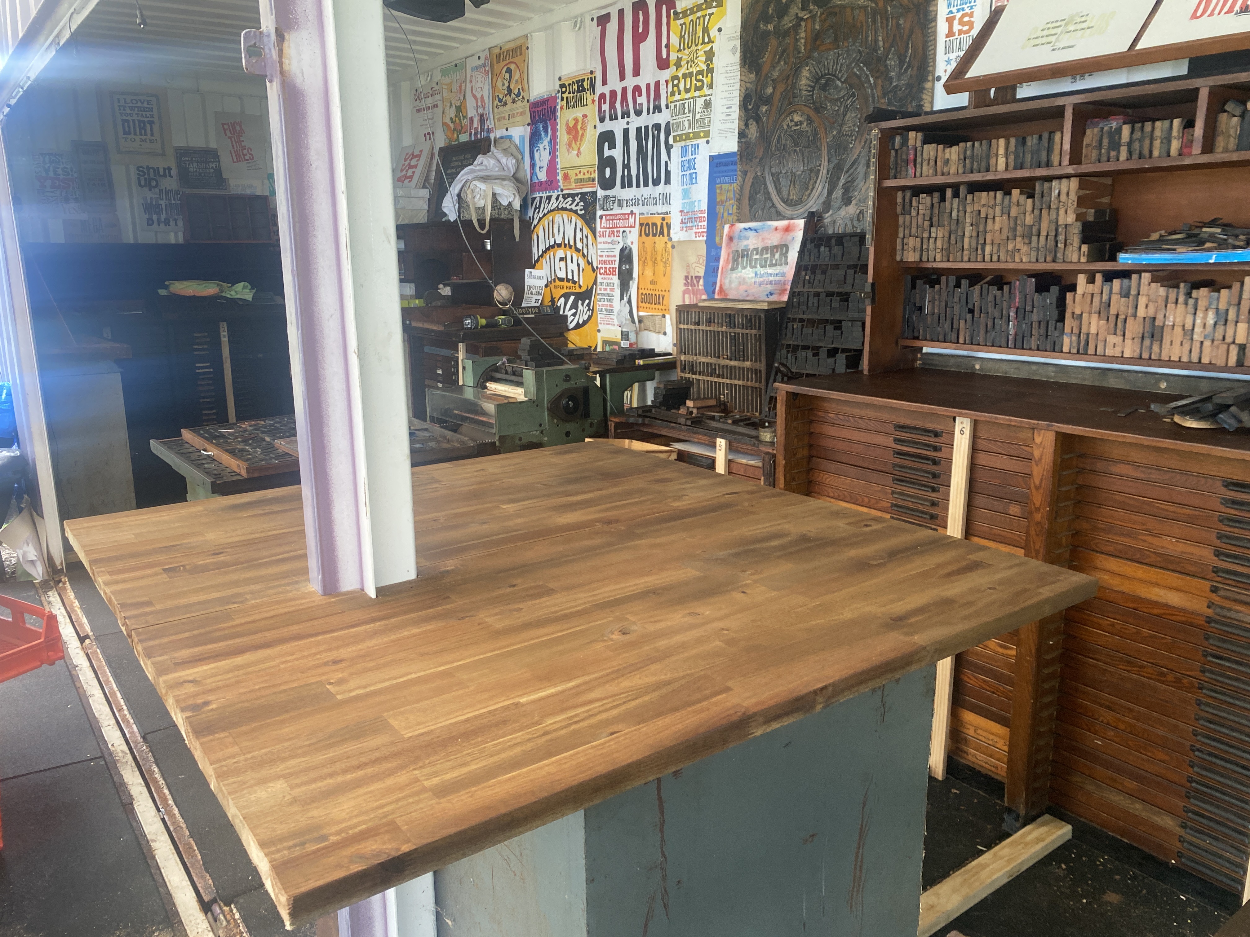
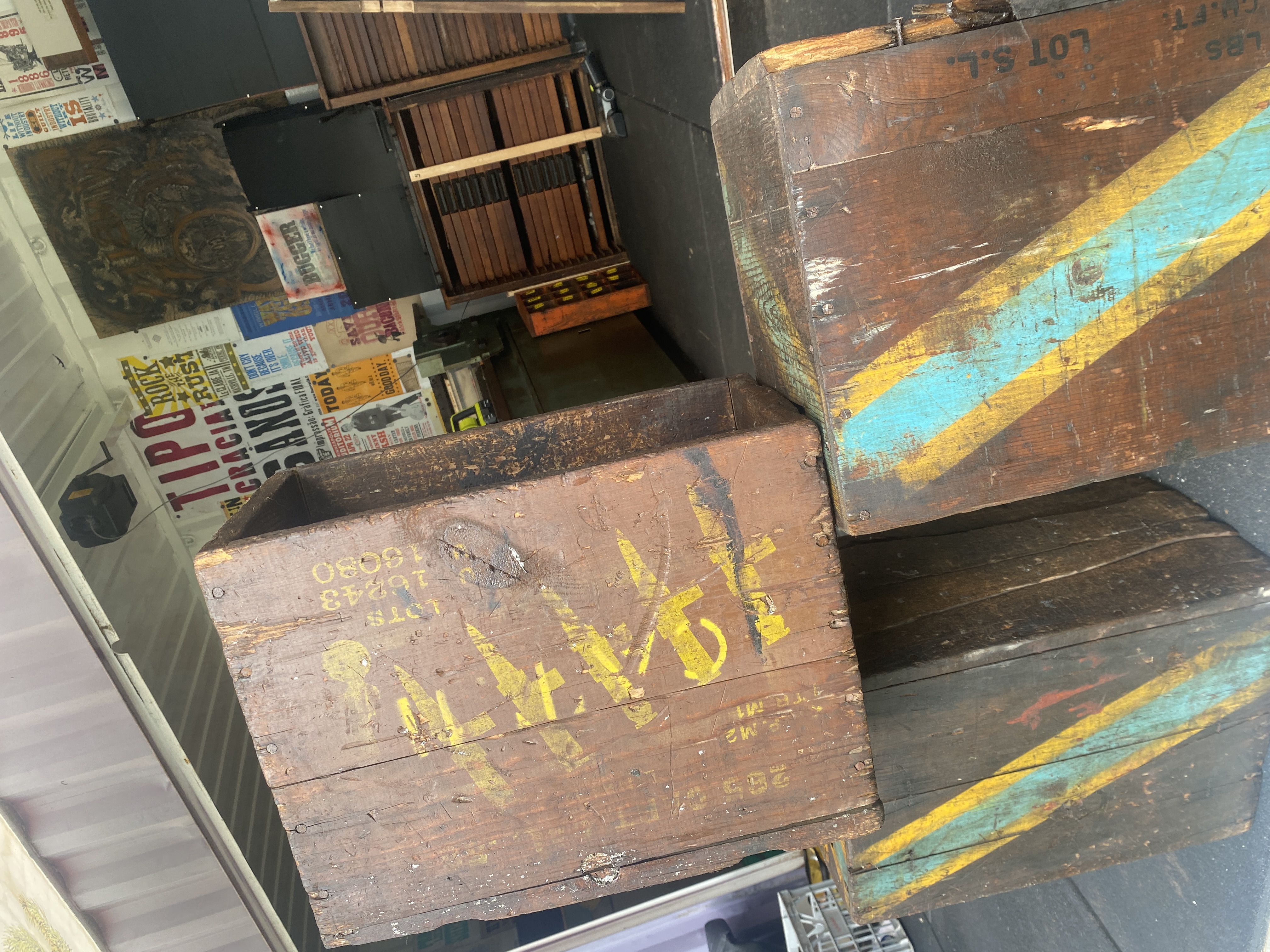
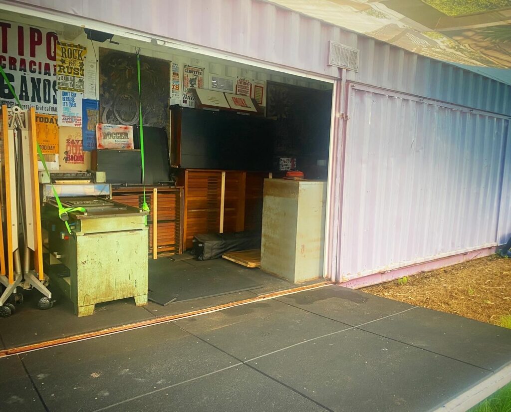
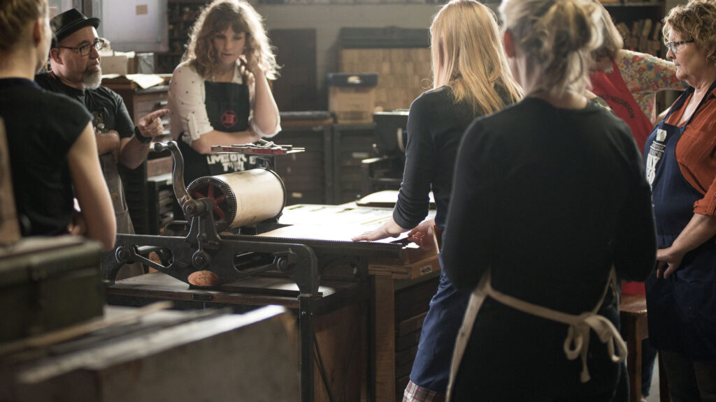
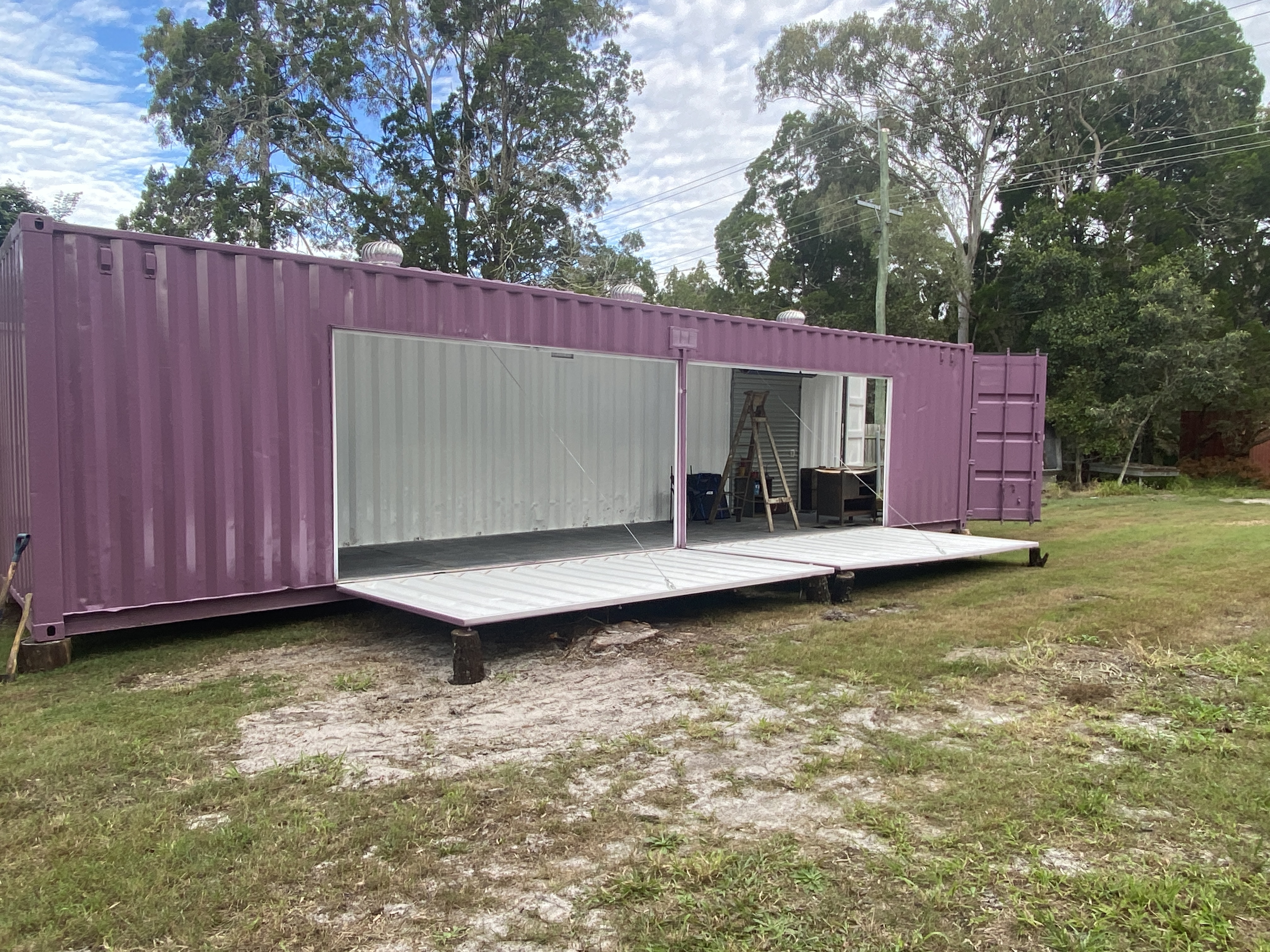
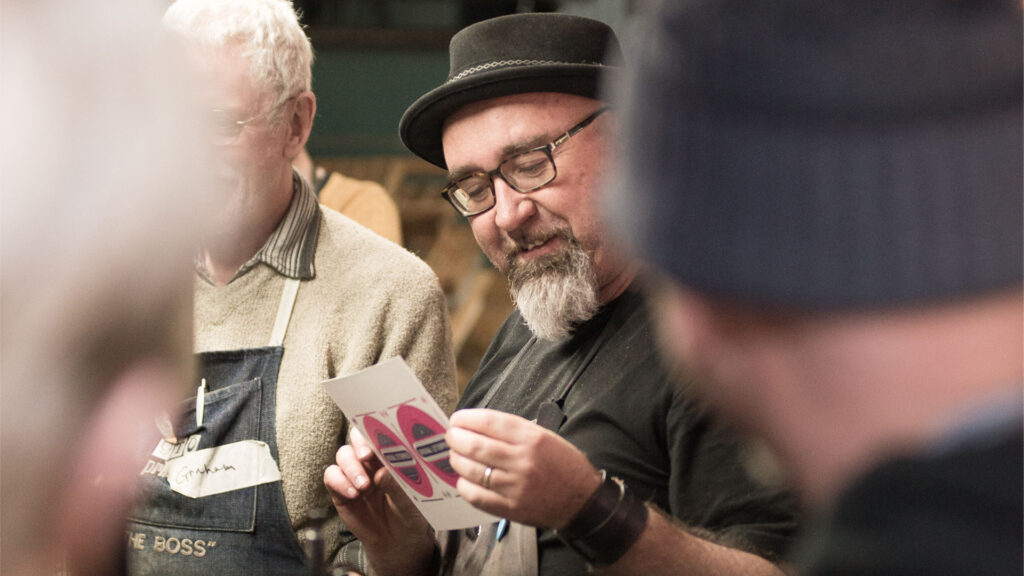
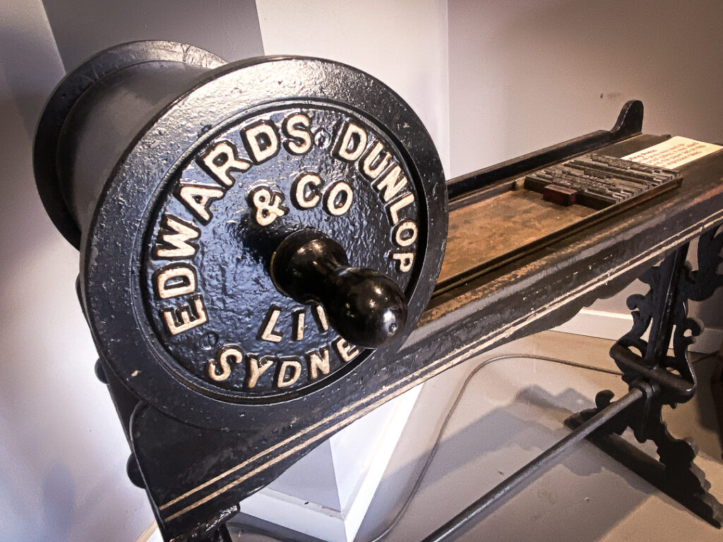
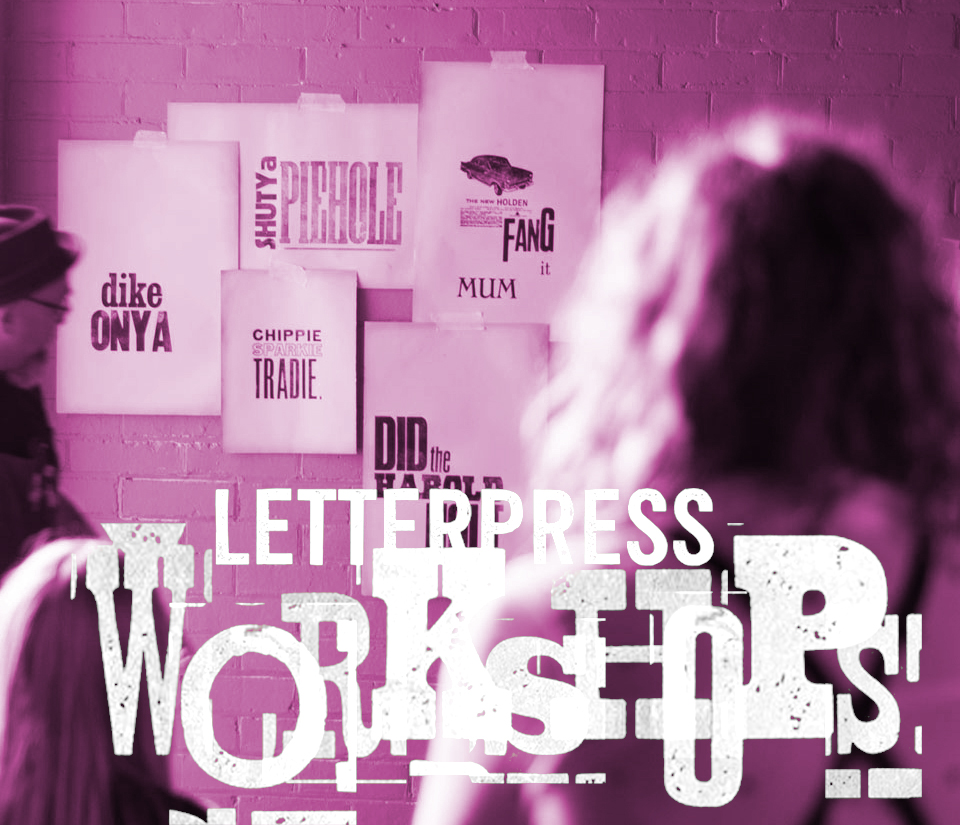
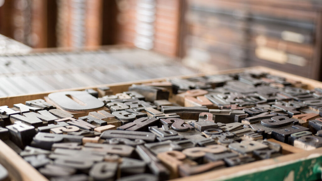
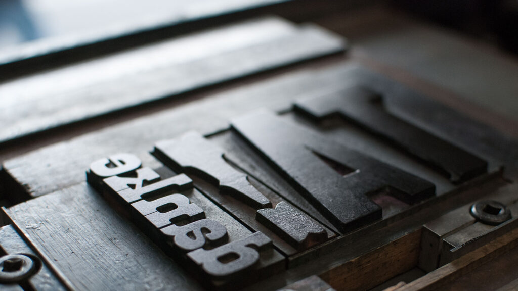
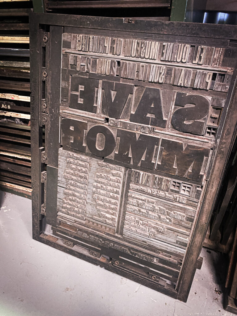
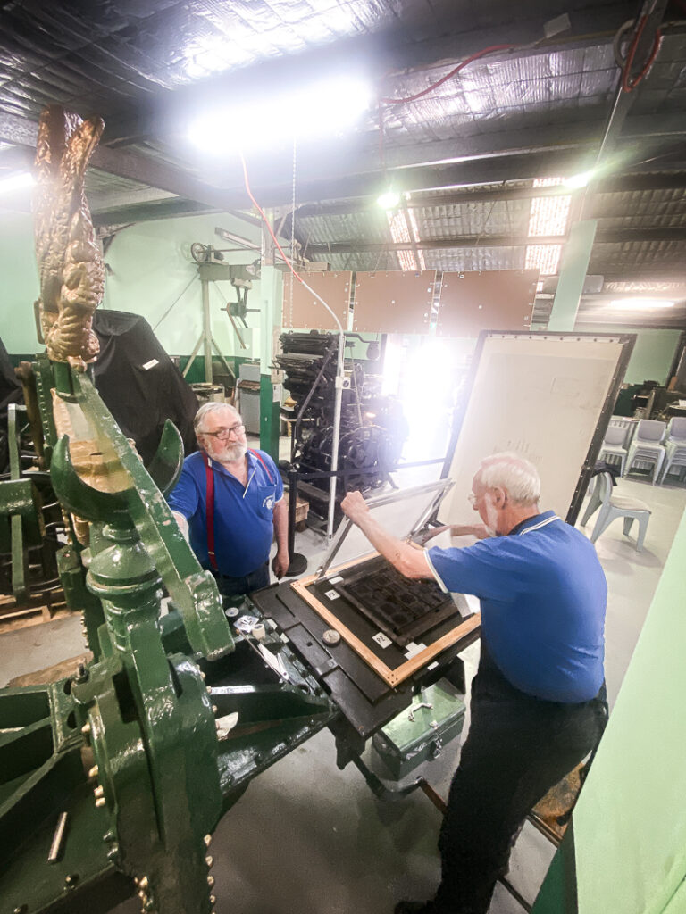
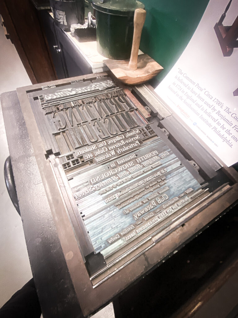
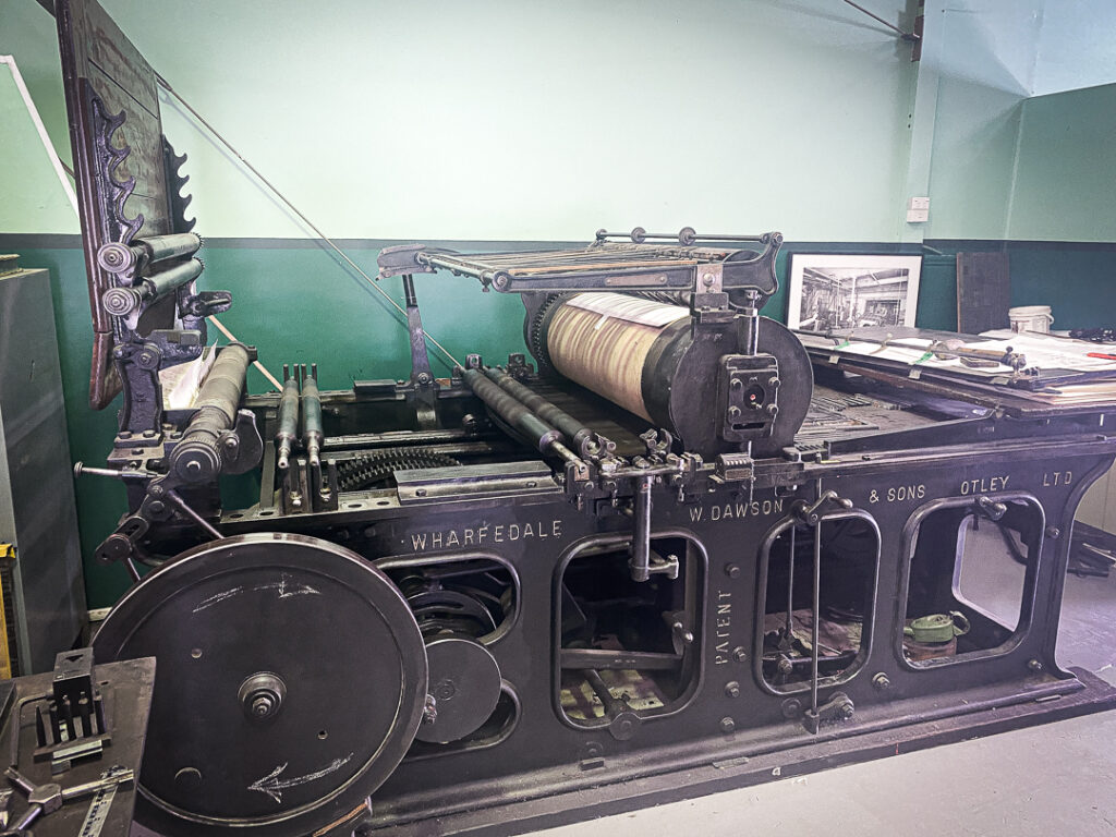
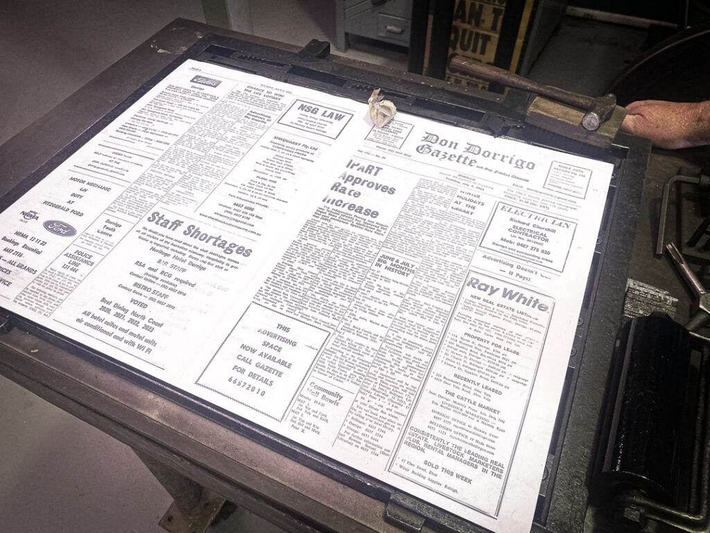
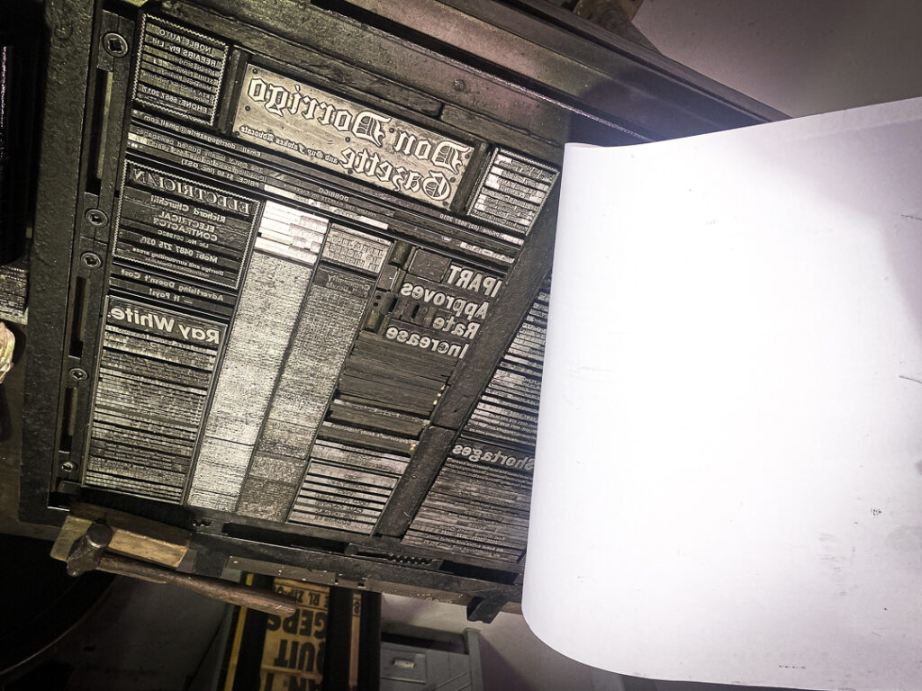
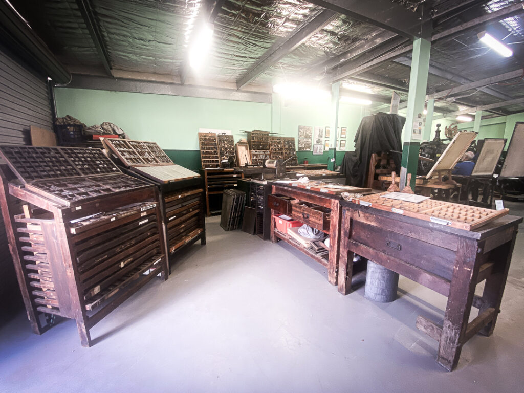
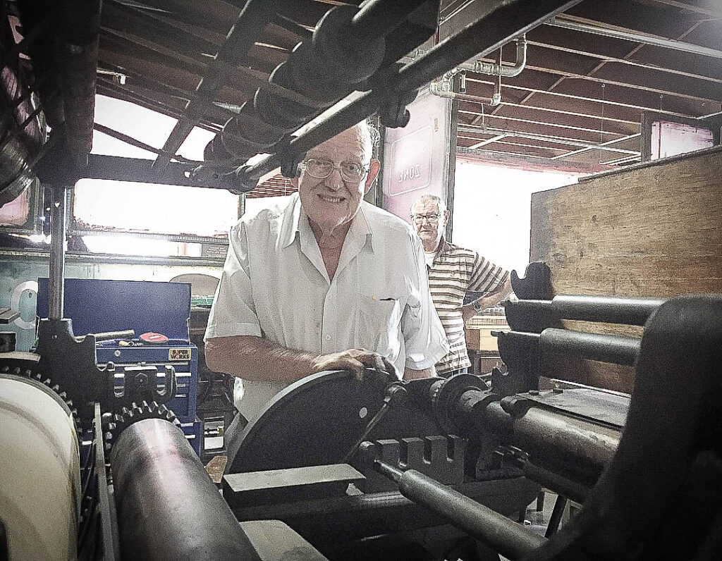
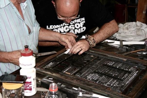
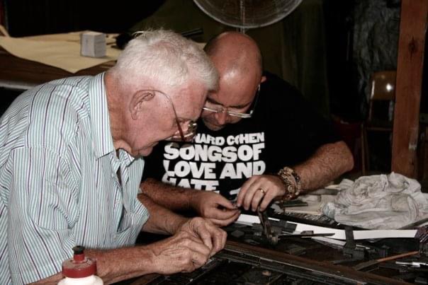
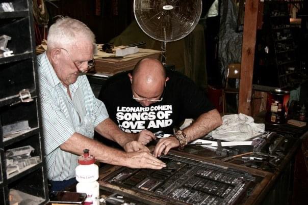
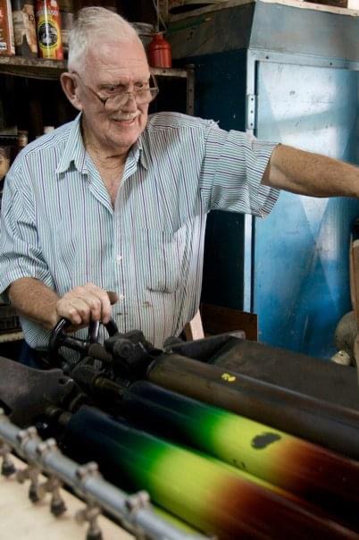
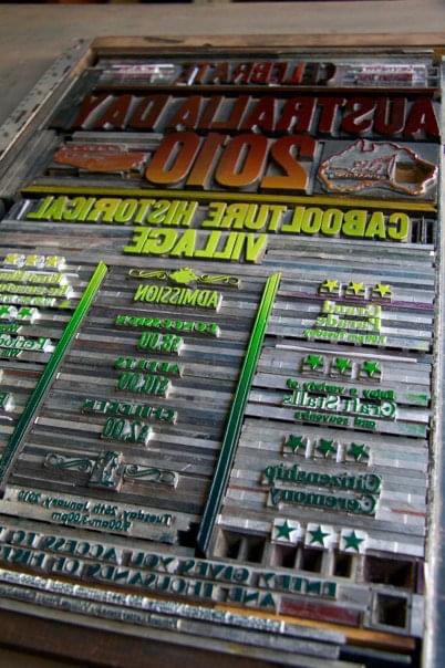
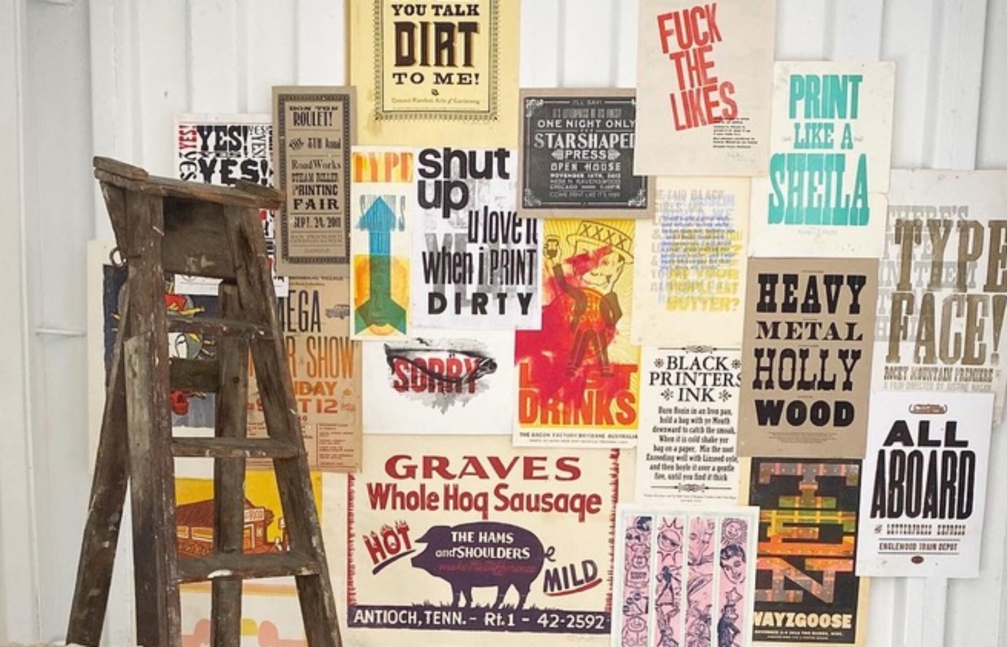
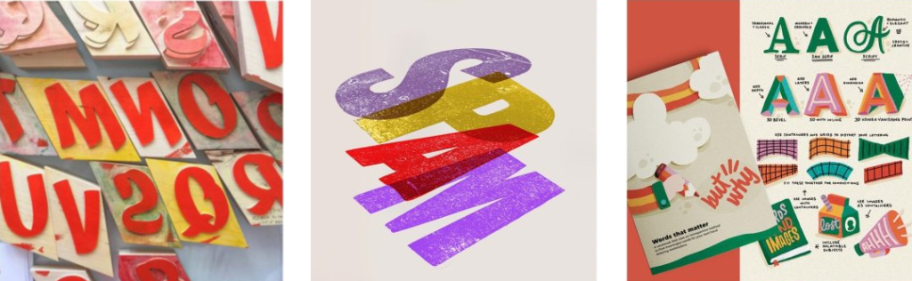
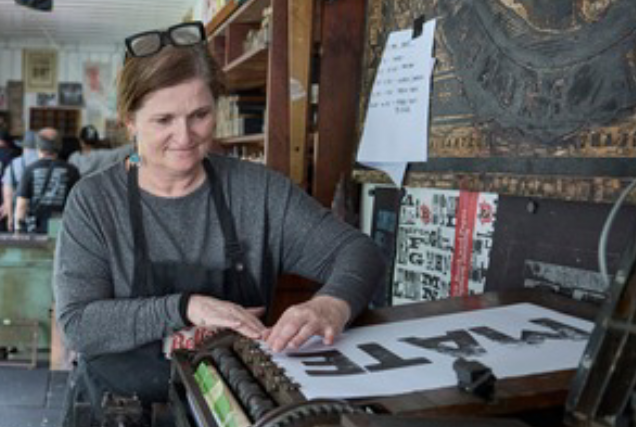
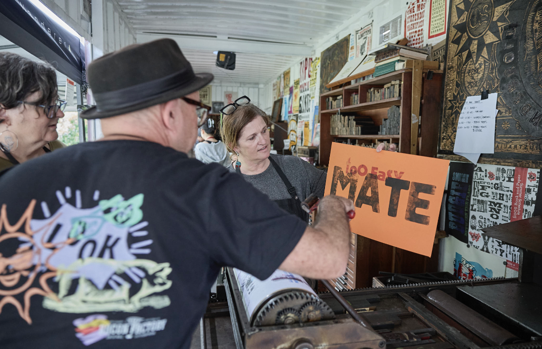
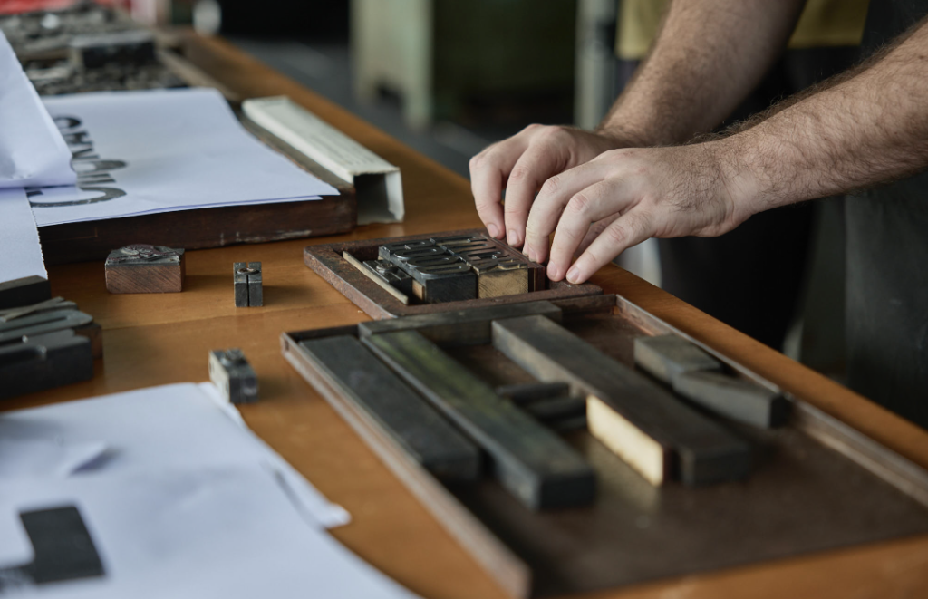
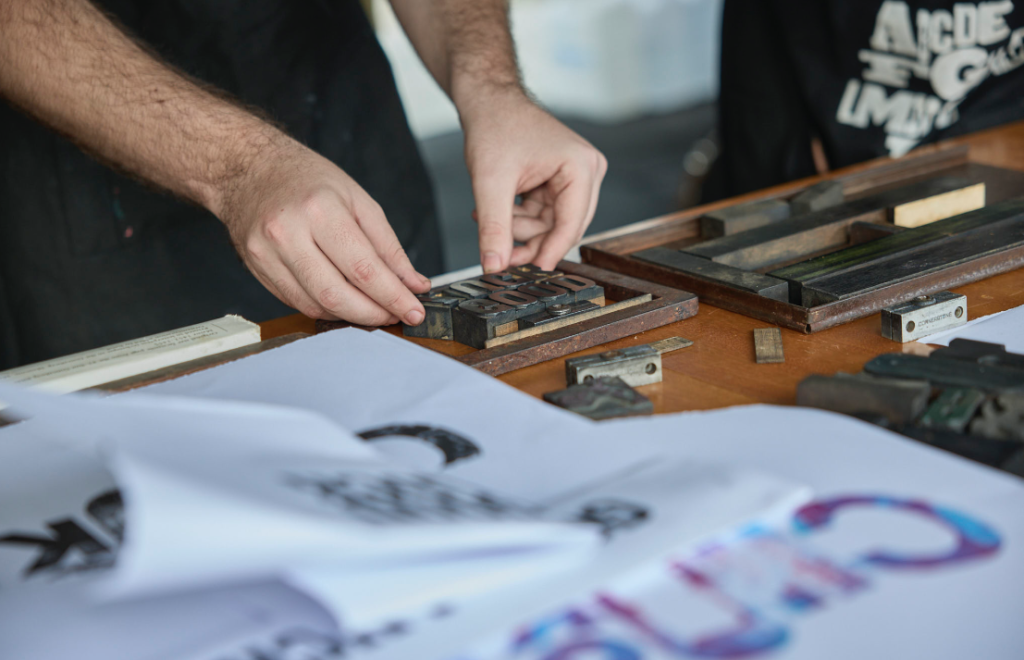
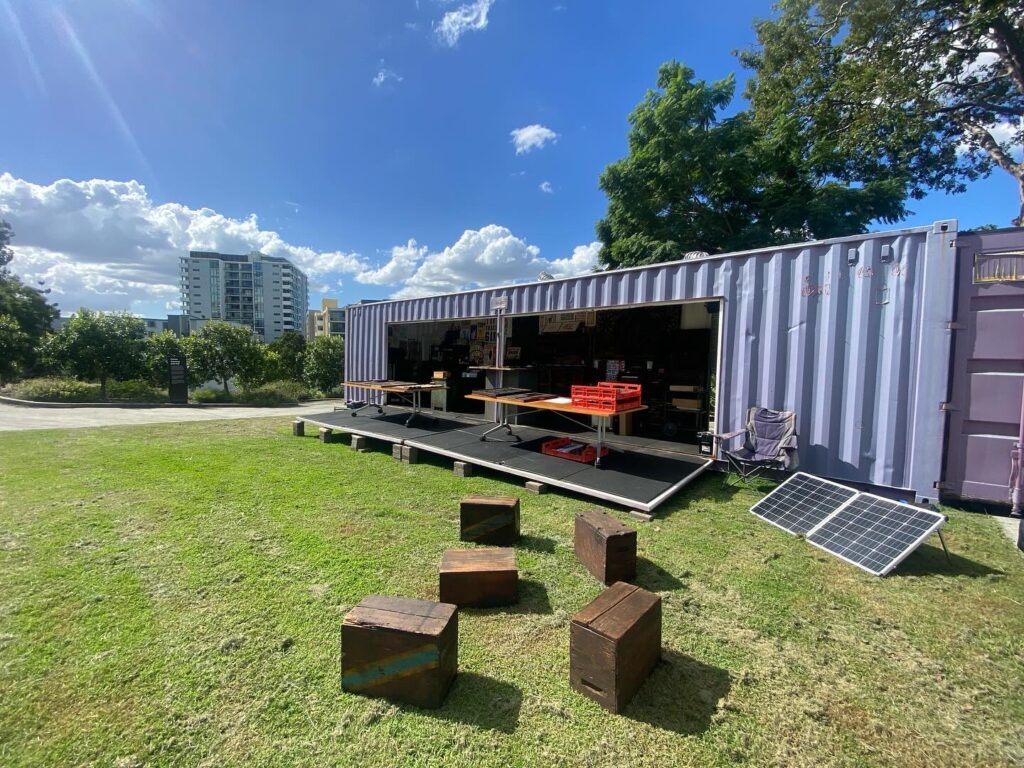
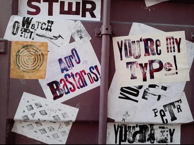
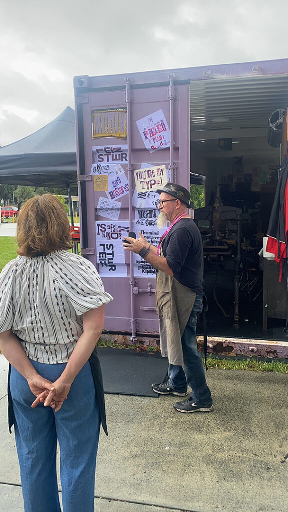
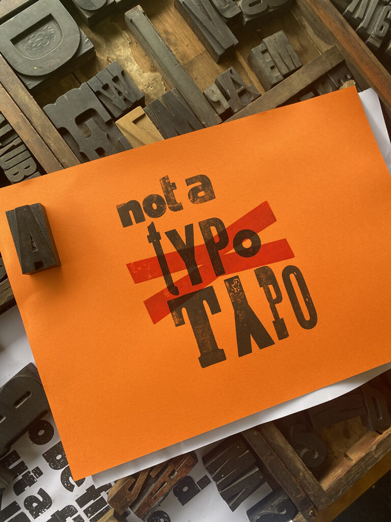
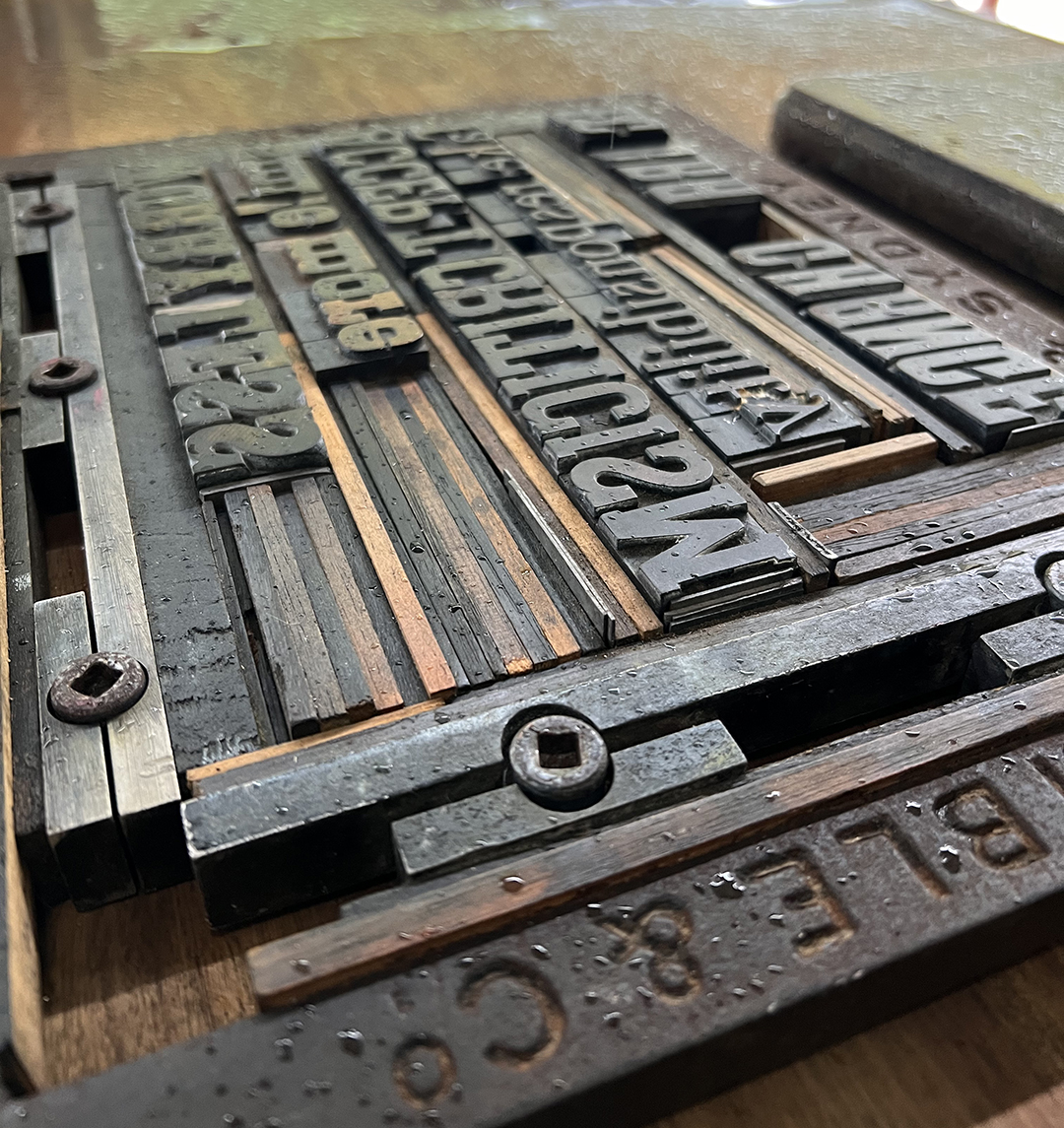
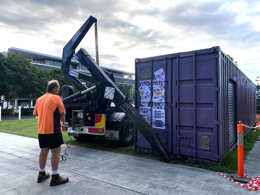
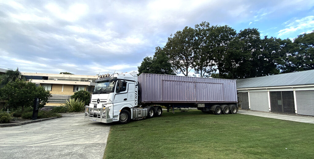
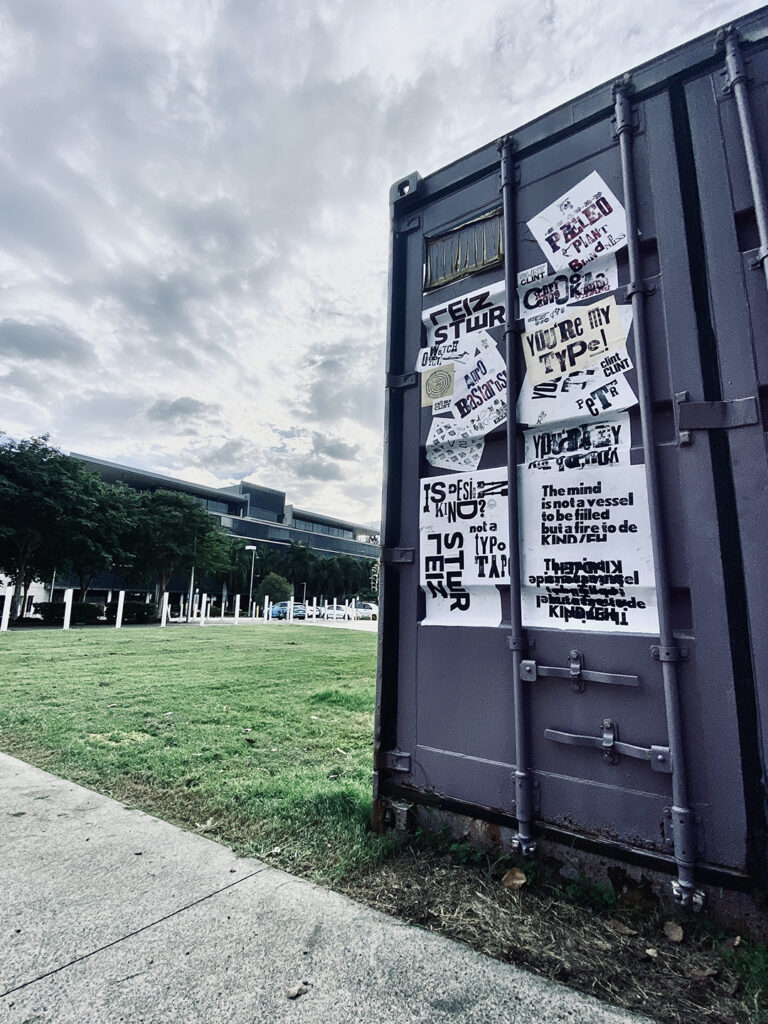
Amidst the multitude of sessions and workshops, the debut of the SPAM container was a highlight not just for me but also for friends and colleagues who have supported the project over the years. Tucked away in the conference program, the SPAM workshops provided a special chance to immerse oneself in the traditional craft of letterpress printing while delving into the rich cultural and historical tapestry of handset typography.

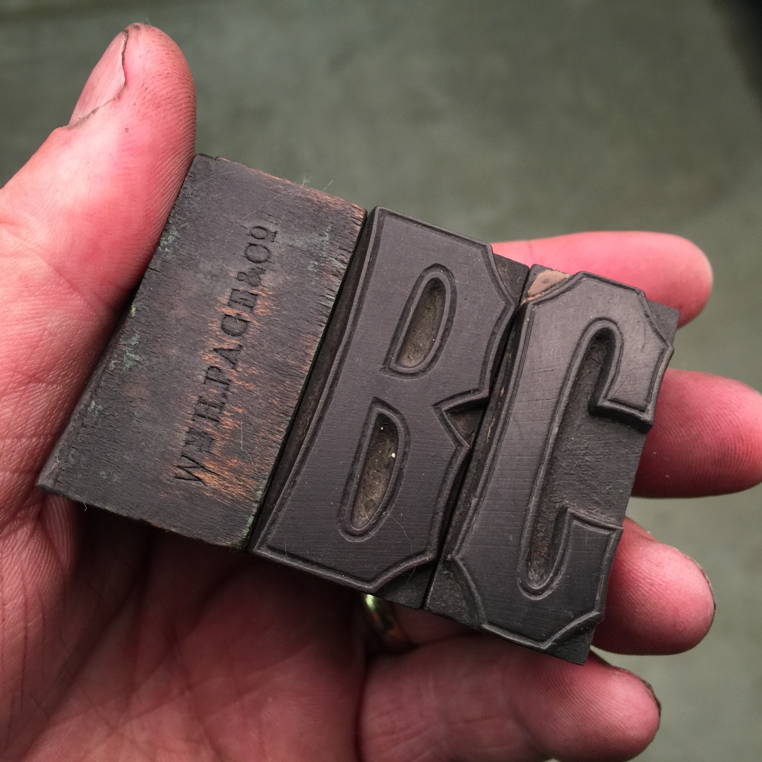
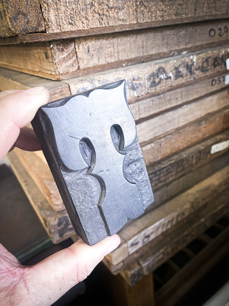
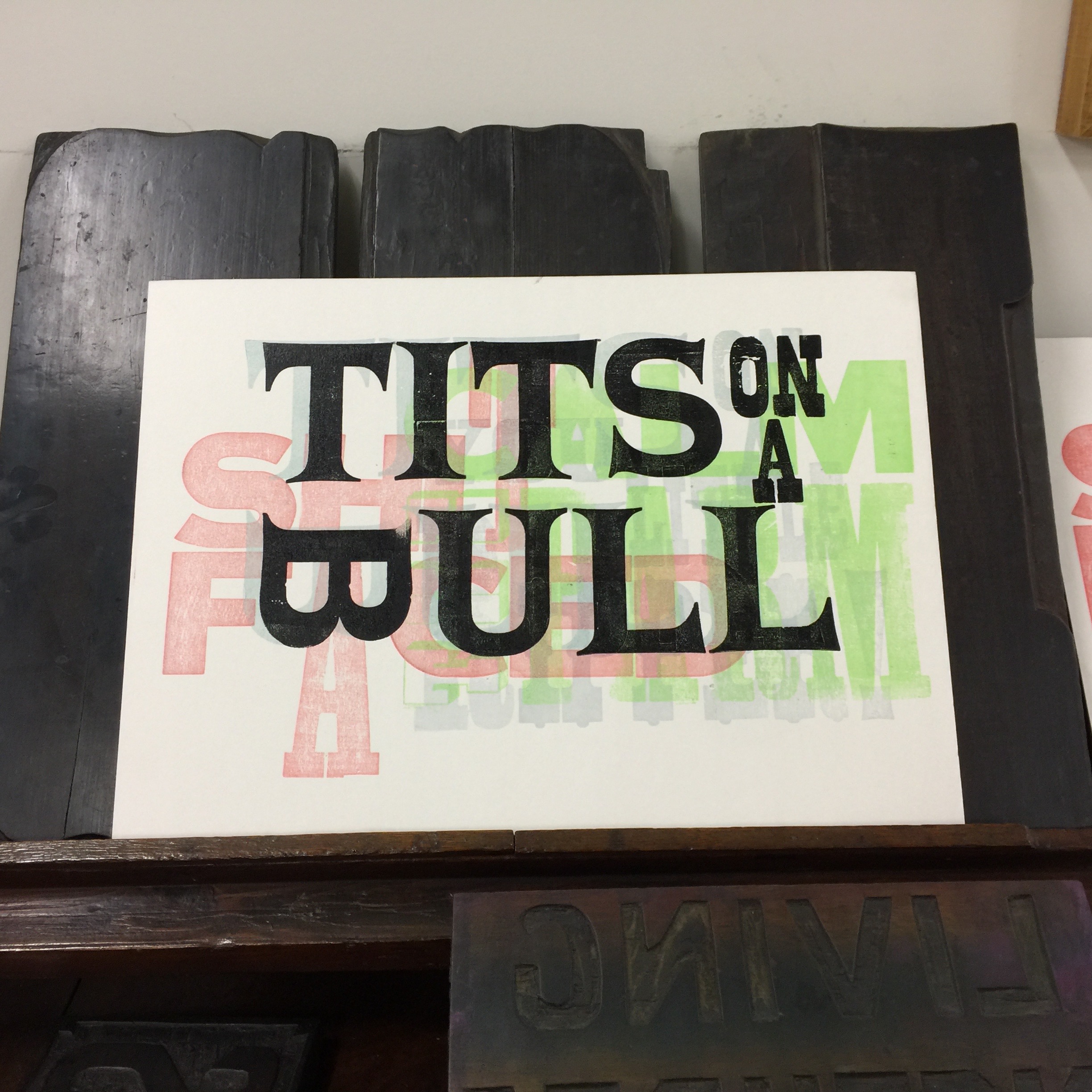
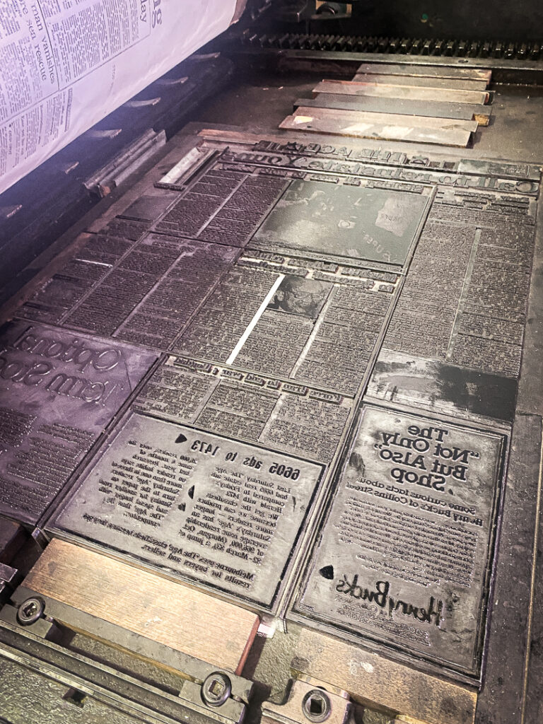
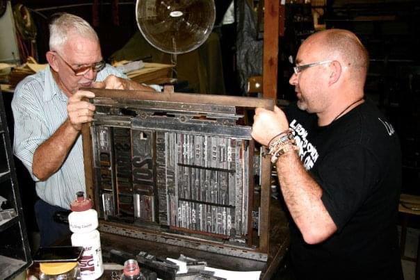
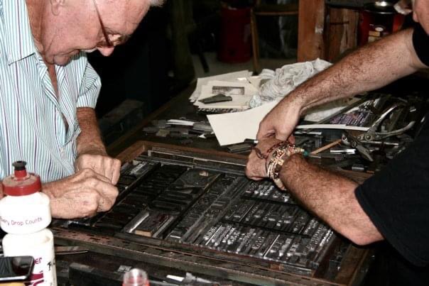
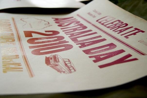
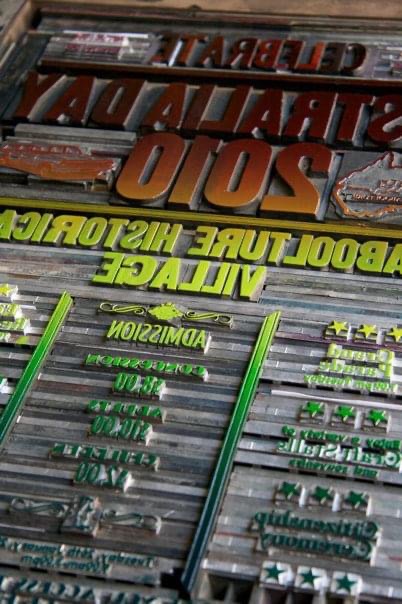
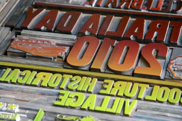
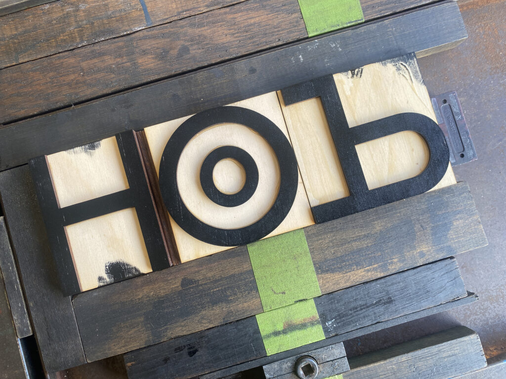
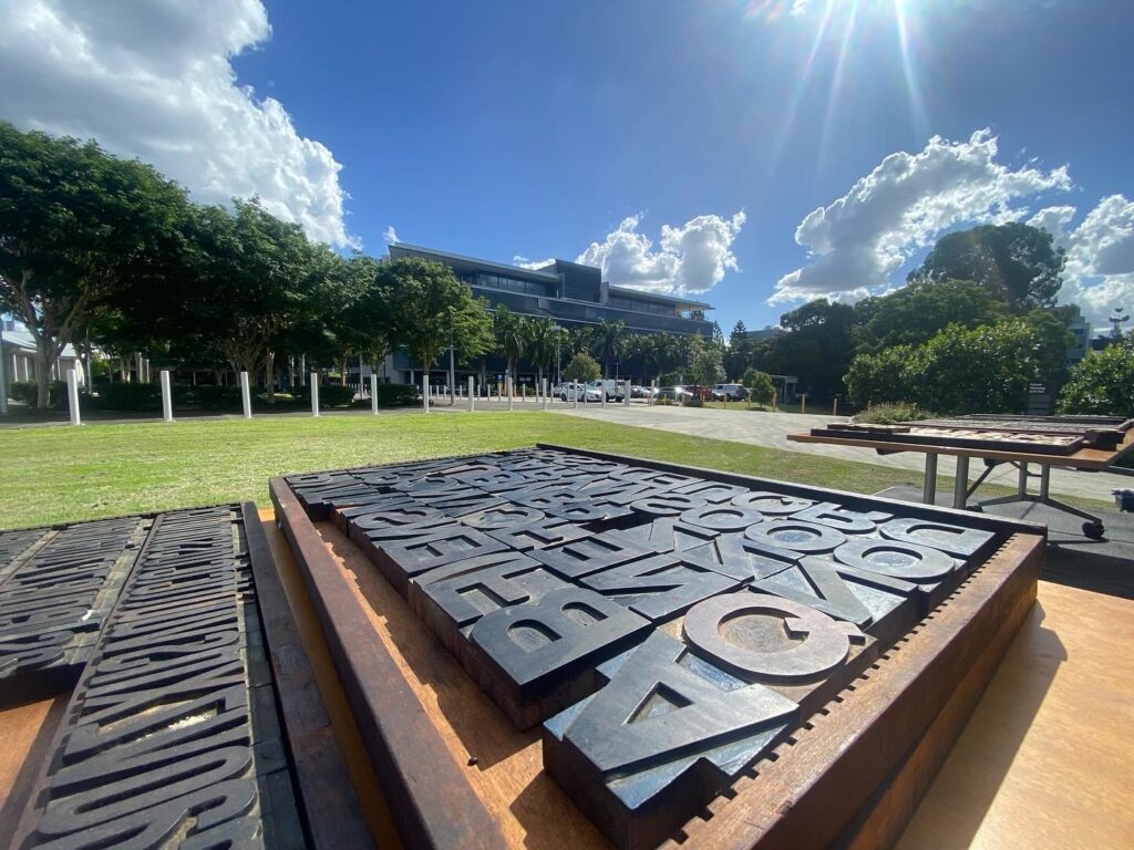
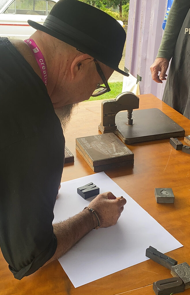
Our SPAM letterpress Container workshop series kicked off with an exploration of colonial Australia’s cattle industry and its unexpected influence on typography. Joined by Troy, Dzintria Menesis and Dr Melissa Silk the “Branding Irons and Blockchains” workshop delved into the origins of Queensland Brand Designs font and the typographic system from the Australian brands act. The workshop consisted of printing type experiments from the custom woodtype font that Troy had designed specifically for the workshop. This prototype typeface that we cut and produced at the Edge makers space at the State Library of Queensland highlighted the optical adjustments required when rotating letterforms for brand designs.

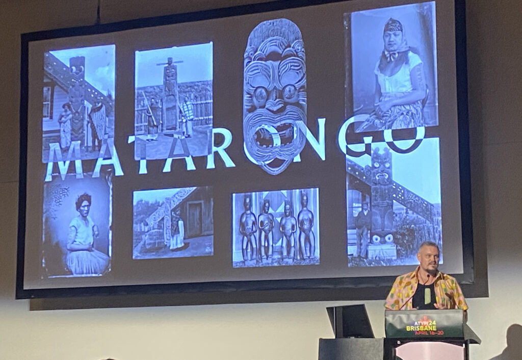
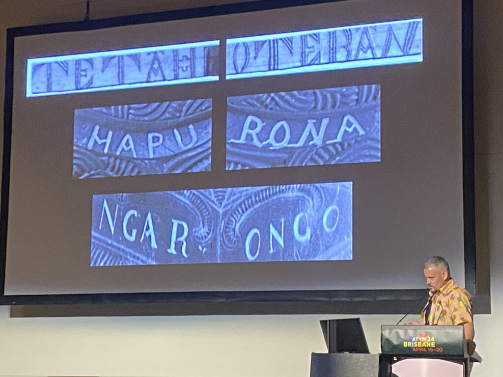
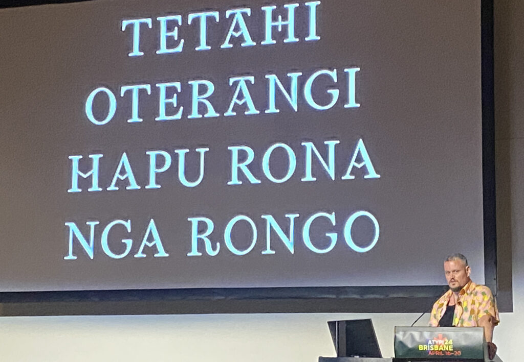
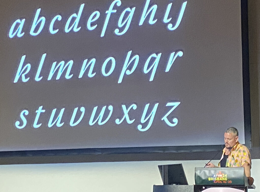
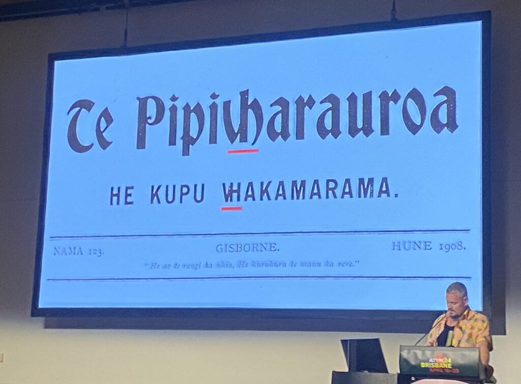
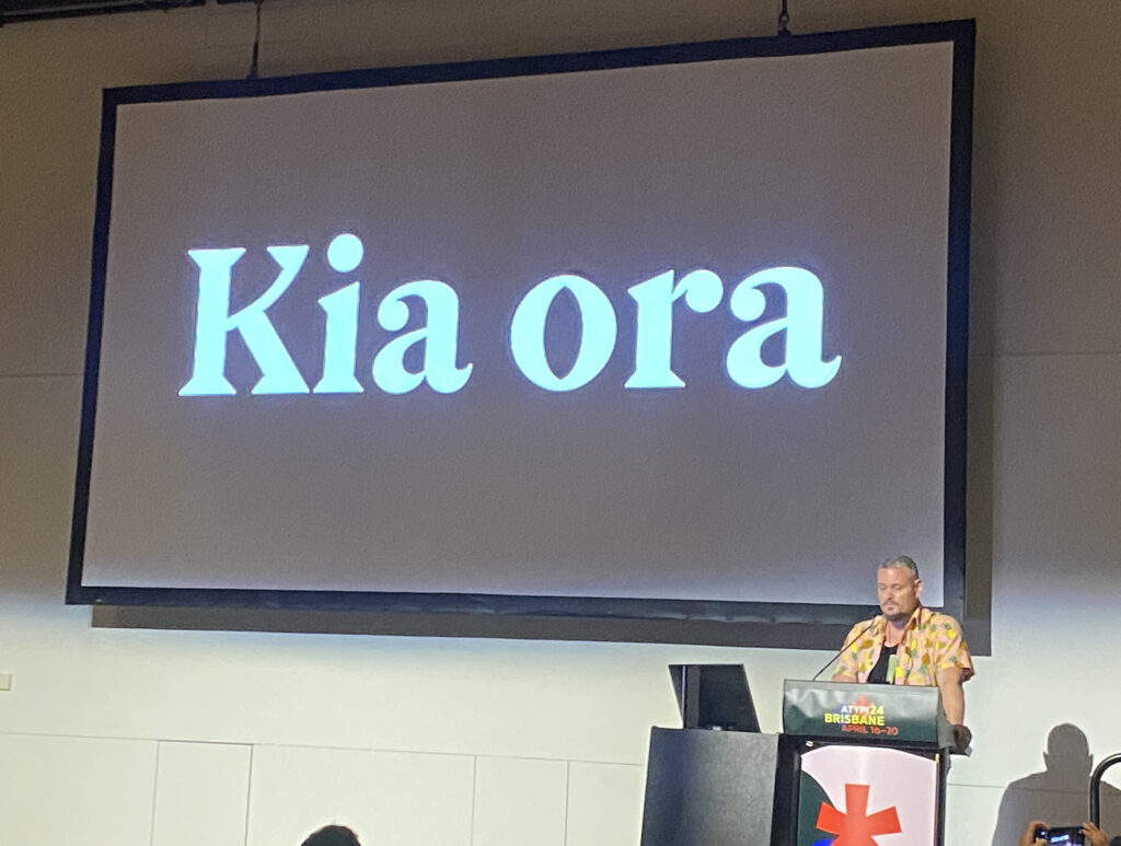
Another highlight for me was the “Matarongo Project” presented by fellow countryman, New Zealand-type designer Chris Sowersby. Collaborating with Dr. Johnson Witehira, Sowersby showcased a typeface family grounded in indigenous research, offering insights into Māori engagement with letterforms and the development of a modern digital typeface rooted in traditional crafts.

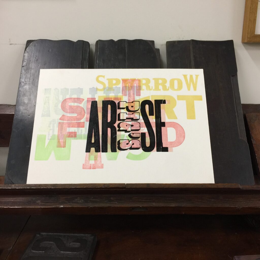
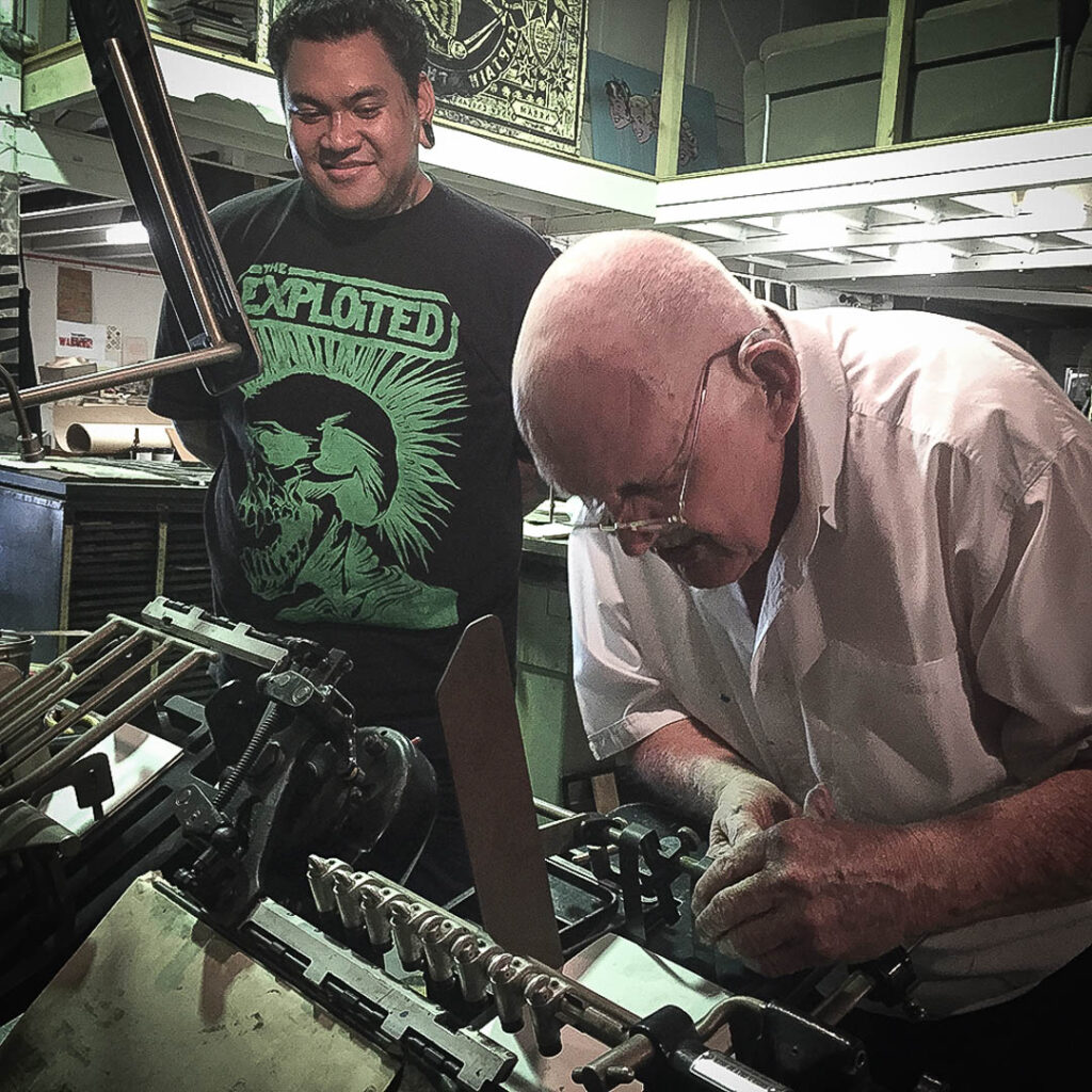
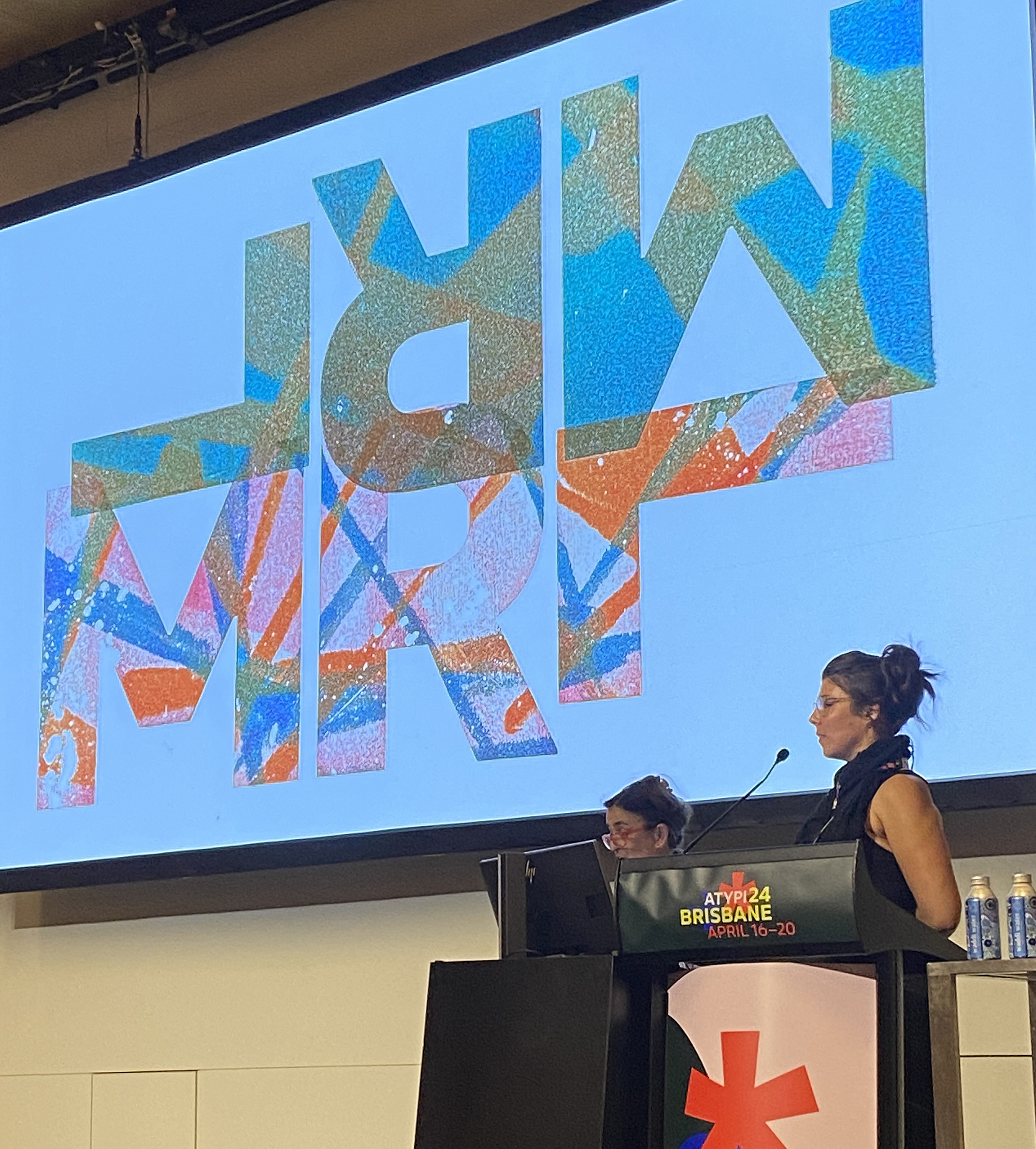
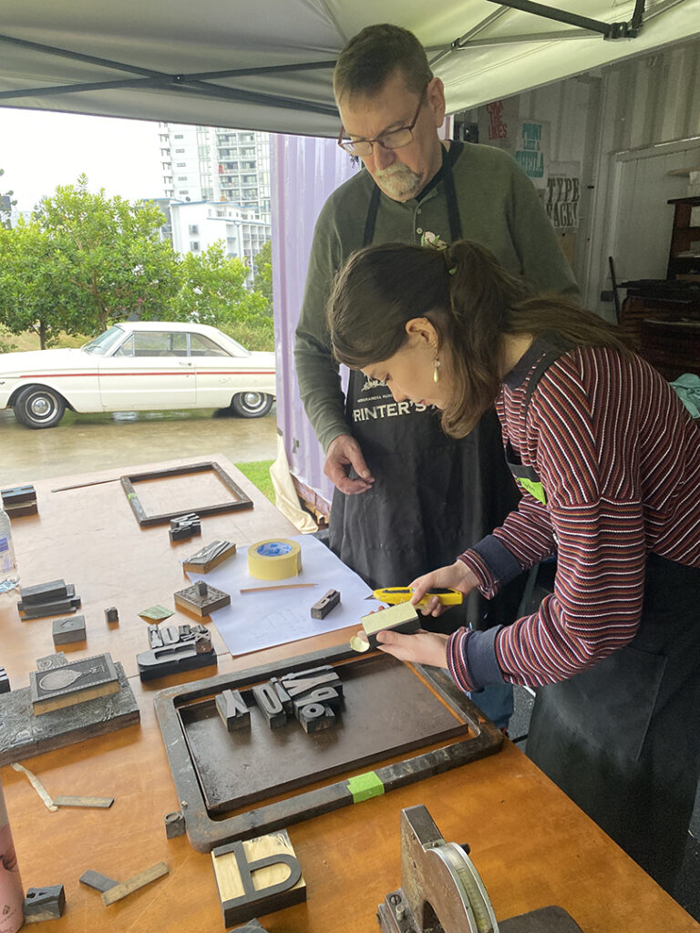
Outside the formal presentations, attendees had the opportunity to network and engage in hands-on printing sessions. A standout session was the Friday night print session hosted at the SPAM Container, where international guests joined local designers to print Wayne Thompson’s Chromatic woodtype font. This gathering exemplified the spirit of collaboration and knowledge sharing that permeated the conference.

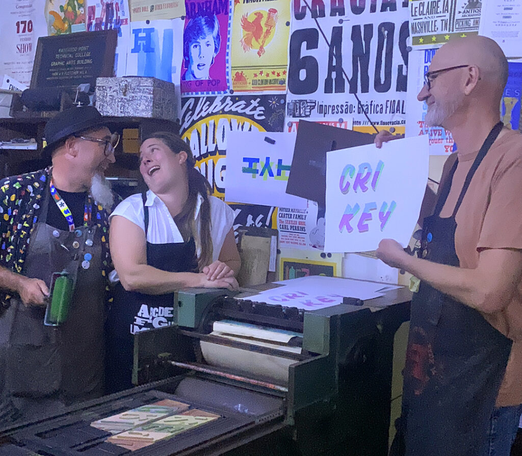
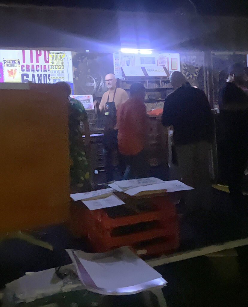
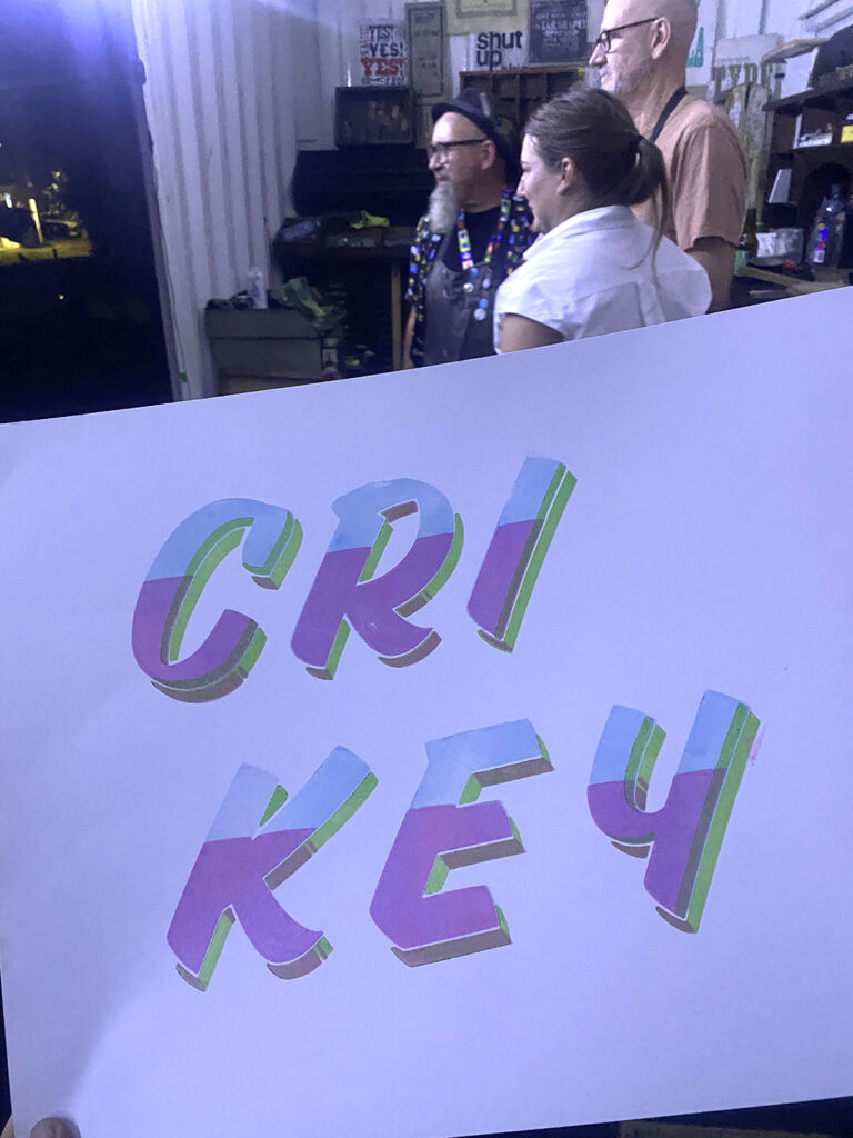
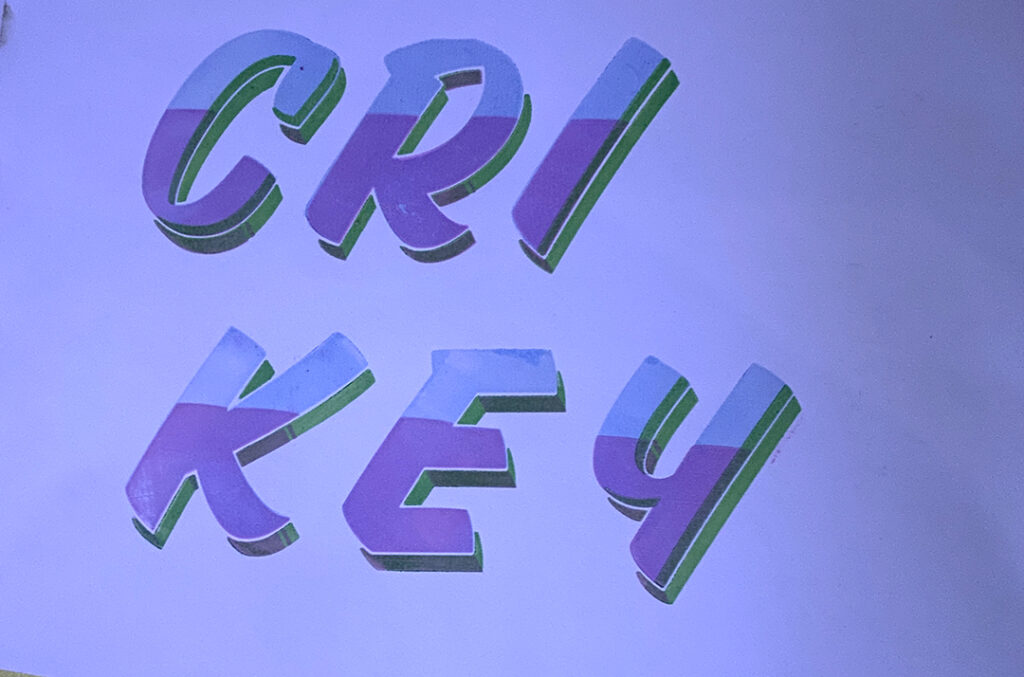
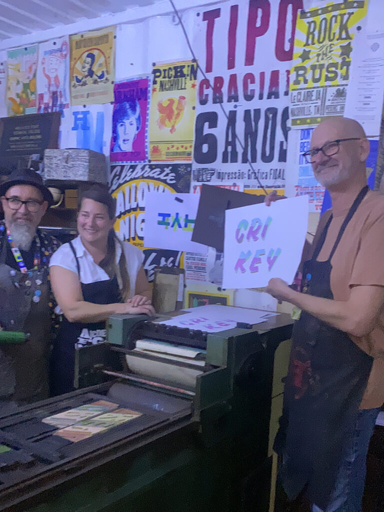
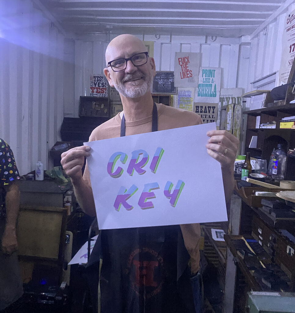
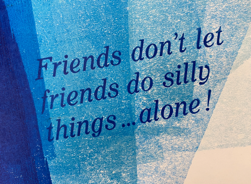
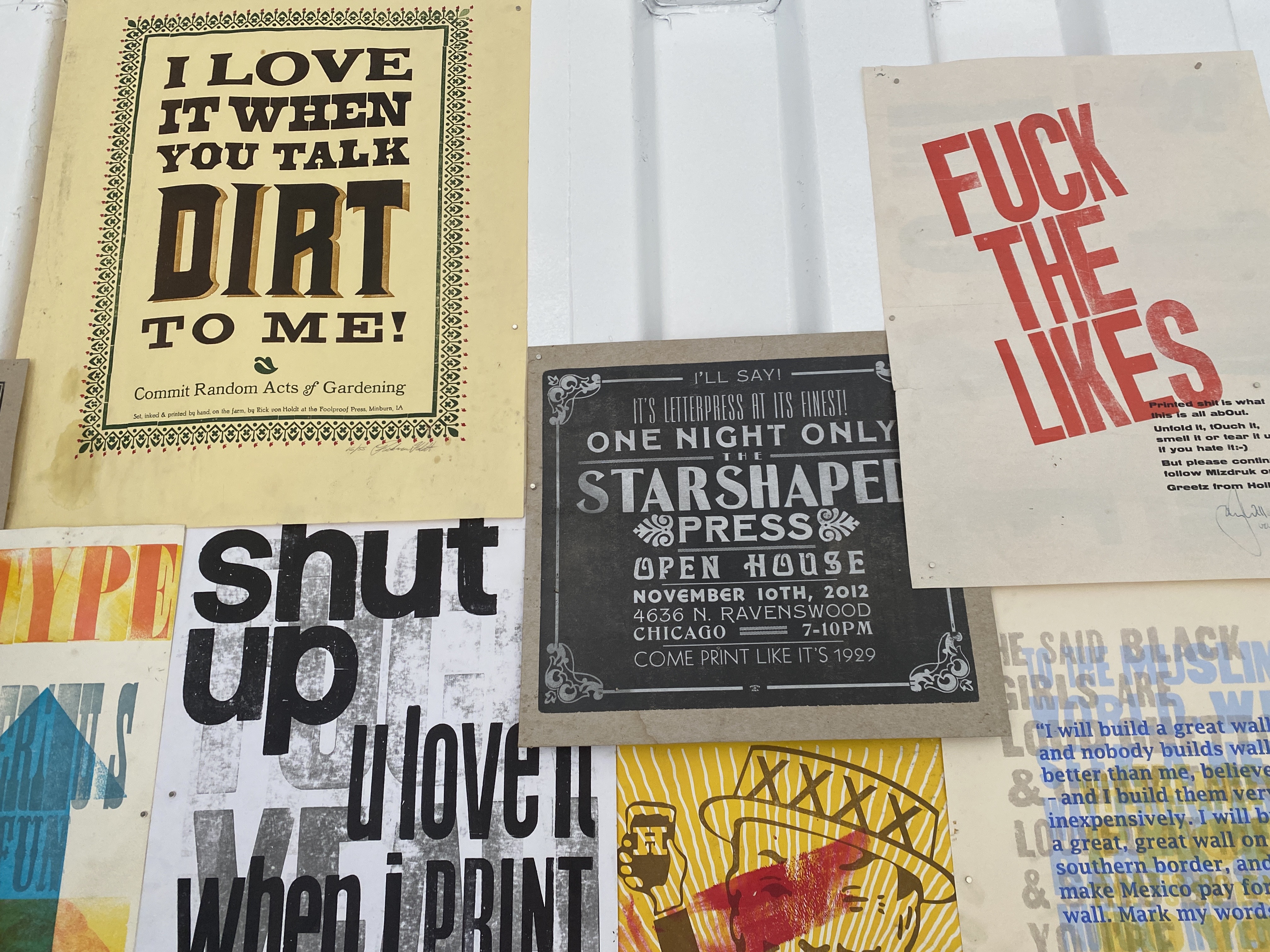
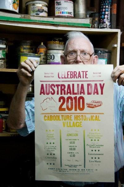
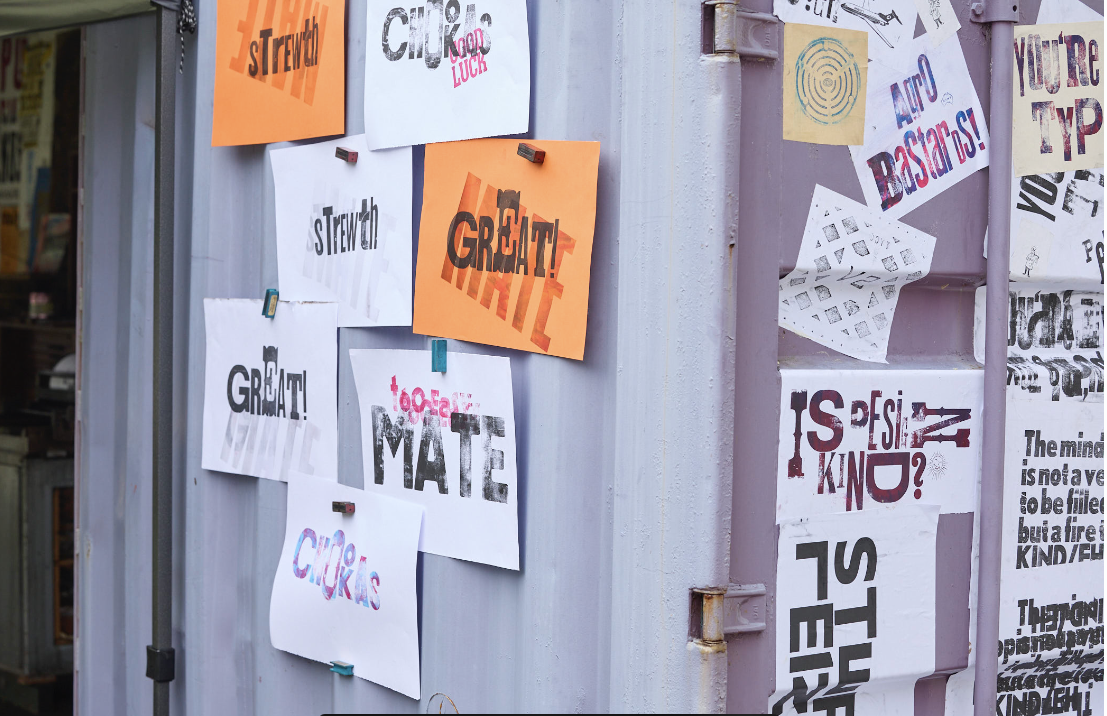
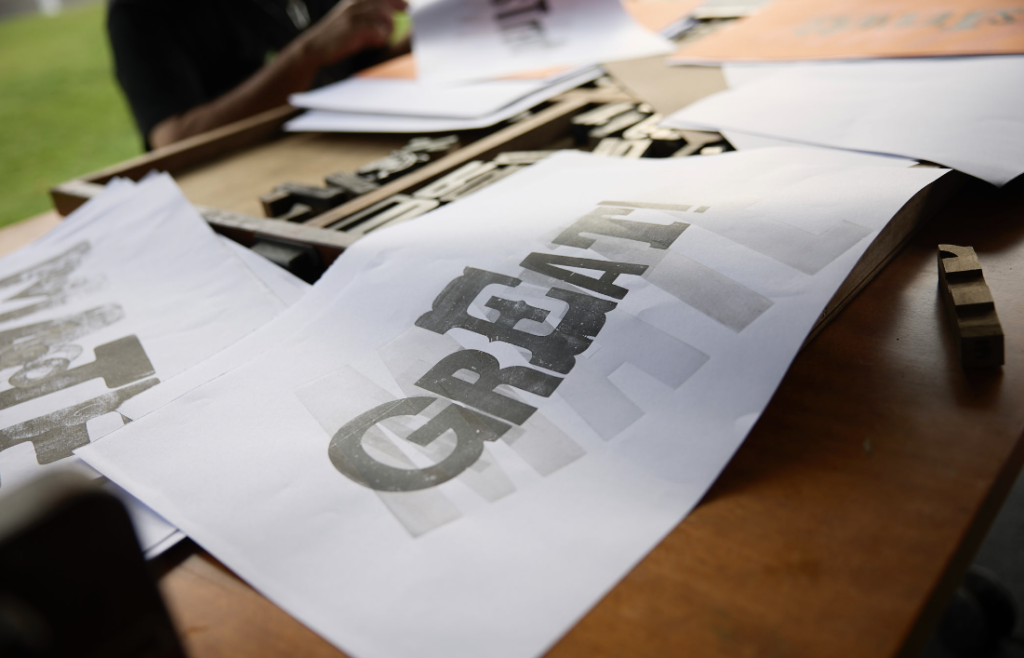
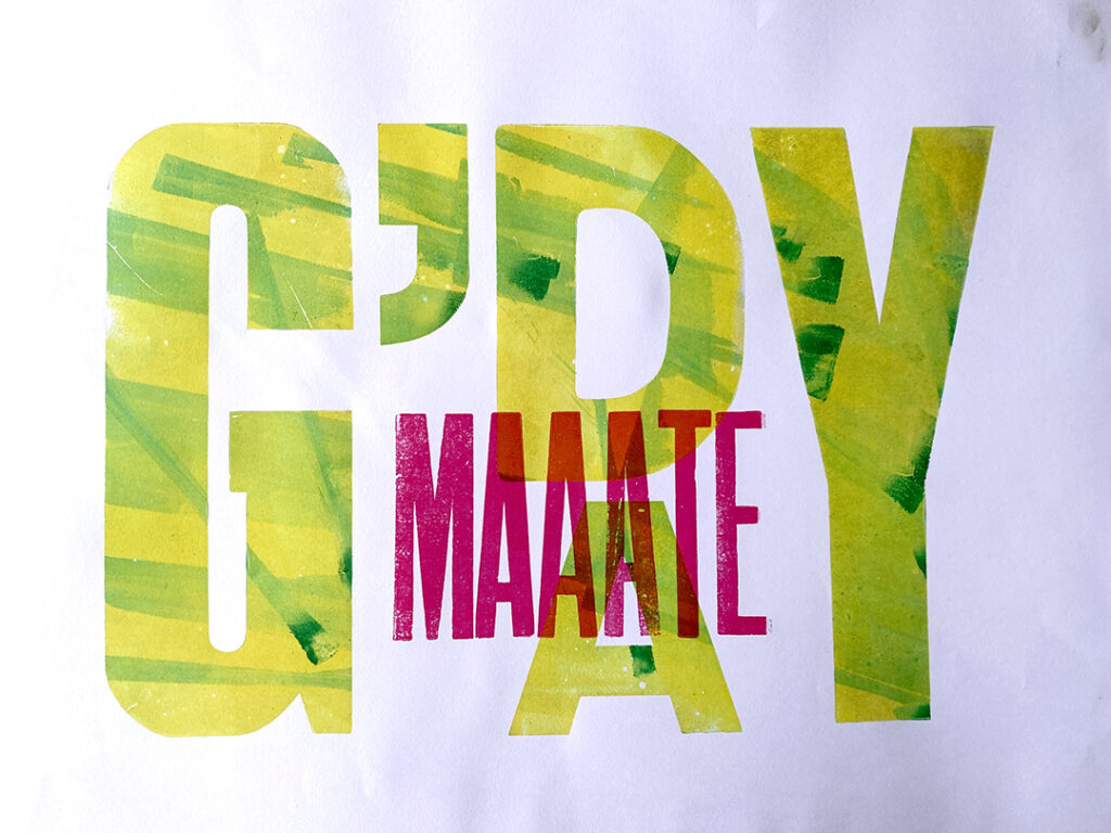
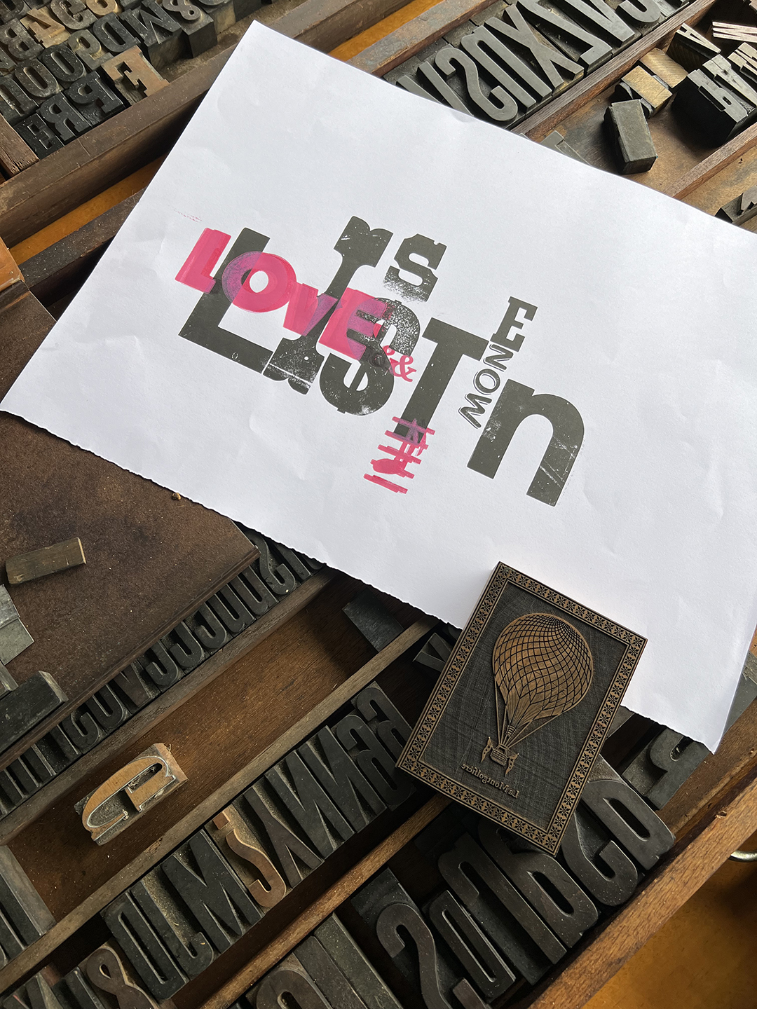
In addition to the conference activities, the SPAM Container opened its doors to four  introductory wood type letterpress workshops, providing the community with access to traditional printing techniques. Participants explored the power of the press while infusing their creations with the cheeky nature of Australian slang, fostering an atmosphere of creativity and camaraderie.

The workshop series culminated in a final Woodtype workshop on Friday, the 26th of April; With our initial SPAM project ideas dating back 3 years, it was a special moment to be able to share the project with the community. and see the project become a reality. Accommodating ten participants within the container, this immersive experience offered a glimpse into the revival of letterpress printing for regional and remote Australia. With a focus on community engagement and education, the SPAM container will bring the art and history of letterpress printing to new audiences across the country.

As the conference concluded and the container was packed down, SPAM looked ahead to future destinations, eager to continue sharing the power of the press with communities far and wide. With a commitment to preserving and promoting traditional printmaking techniques, SPAM embodies the spirit of innovation and collaboration that defines the global typography community.

As we reflect on this inaugural outing of the SPAM container, it’s clear that we’ve laid a solid foundation for what’s to come. The enthusiasm and passion for letterpress printing that we’ve witnessed during this journey have been truly inspiring. As we embark on our mission to travel the country, spreading the love for letterpress far and wide, our path forward looks promising. With each workshop and event, we’re forging connections, igniting creativity, and fostering a vibrant community of type enthusiasts. 

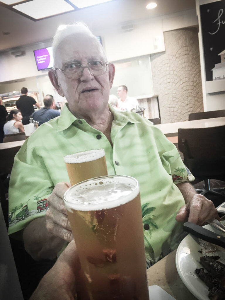
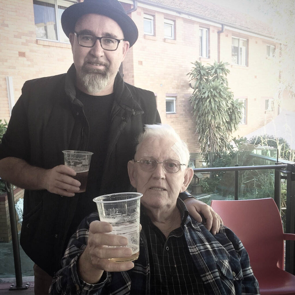
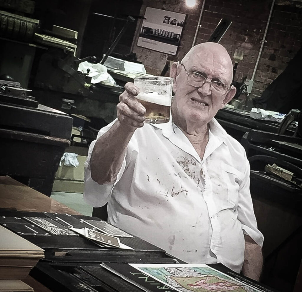
As I sit down to pen this blog post and enjoy a beer, I find myself filled with a profound sense of gratitude and reflection. The journey of the project has been nothing short of extraordinary, and I am humbled by the incredible support and encouragement we have received along the way.

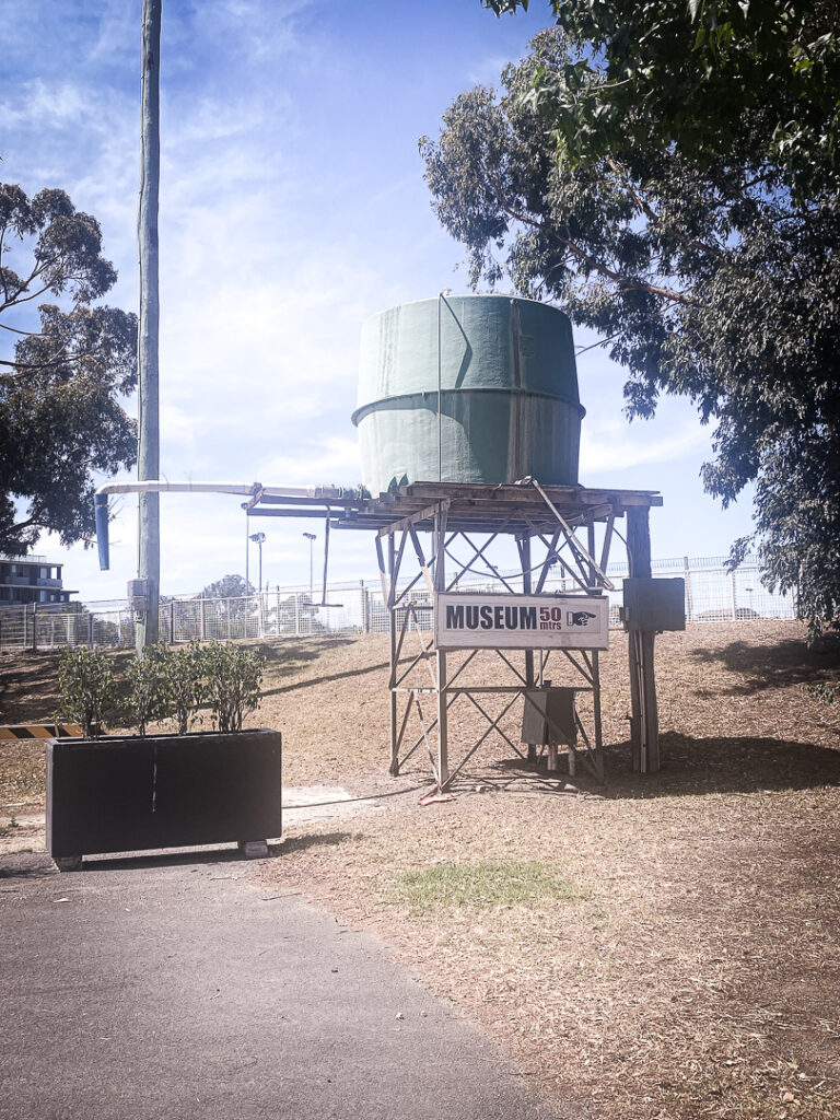
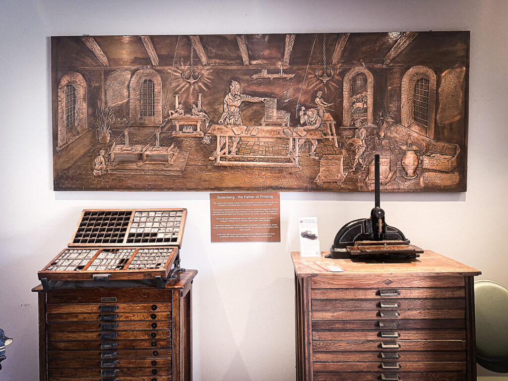
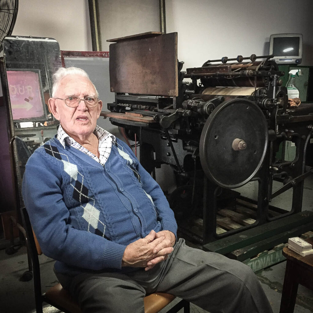
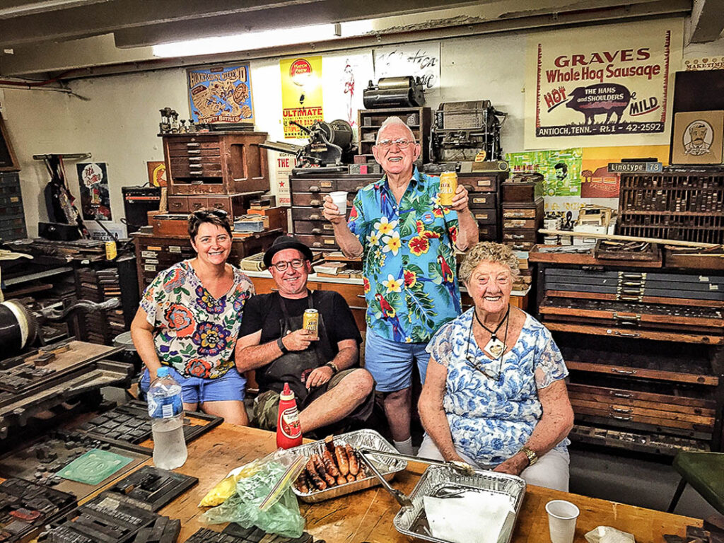
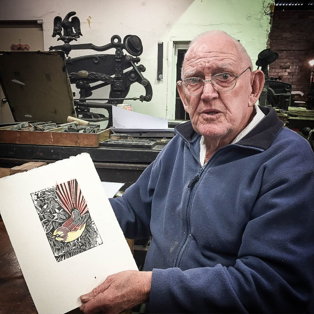
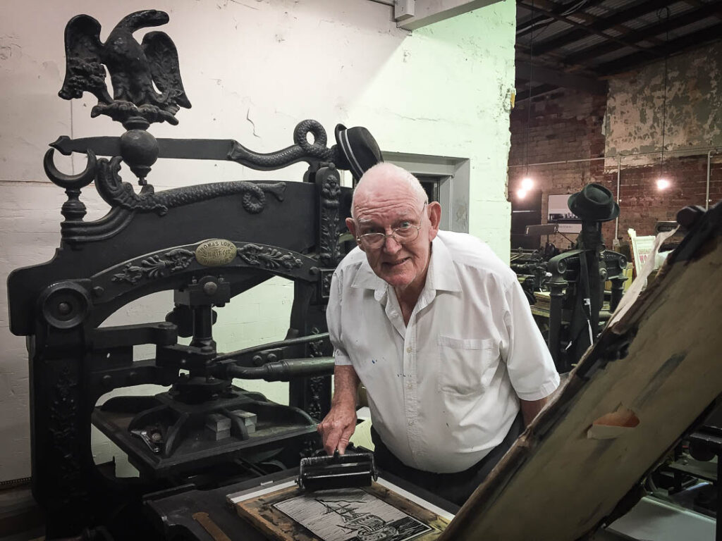
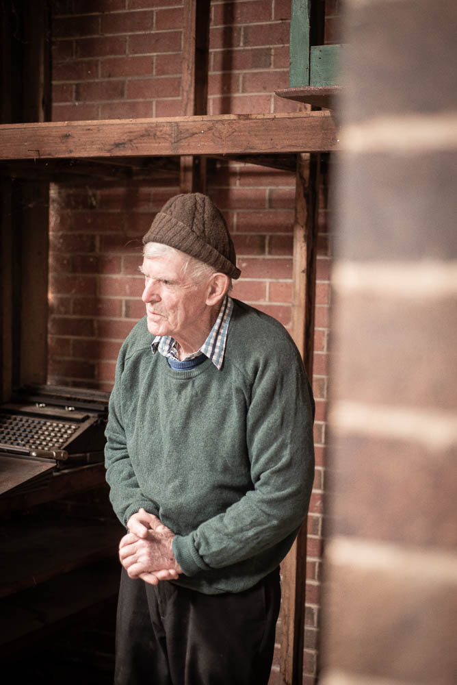
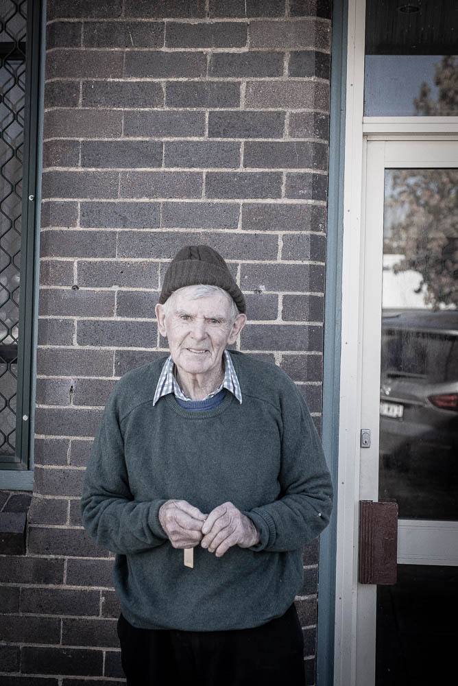
First and foremost, I want to extend my sincerest thanks to Dzintra Menesis from the Museum of Printing in Armidale. Dzintra’s unwavering support and belief in the SPAM Project have been a guiding light throughout this endeavour. Her passion for the art of printing and her willingness to push this project over the line has been truly invaluable. Dzintras’ belief and enthusiastic encouragement played such a pivotal role in shaping the SPAM Project into what it is today. Thank you Zin for being such an integral part of this journey.

I also want to express my gratitude to Barnaby Florance for his support and muscle in helping us move items into place with only weeks before the launch. Barnaby’s willingness to roll up the sleeves and dive into the nitty-gritty details was a testament to hisfriendship and his commitment to our cause. It also helps that Barnaby’s mum is one of the most recognised letterpress practitioners in the country, and I am sure she would have kicked his ass if he didn’t get involved in our project. 

And last but certainly not least, I want to extend a heartfelt thank you to my family for their ongoing support and encouragement to my crazy idea to pack all this scrap metal into a shipping container. As my brother calmly stated its a 40′ Tacklebox full of upper and lowercase sinkers.

As we look back on the journey of the SPAM Project, I am filled with a sense of pride and accomplishment. With the support of others, we have embarked on a mission to bring the craft of letterpress printing to communities far and wide, and I am excited to see where this journey takes us next. To all who have supported us along the way, a big fat thank you. Your contributions have made a king size impact, and I am forever grateful.

Here’s to the next chapter of the SPAM Project and the countless adventures that lie ahead. With your continued support, I have no doubt that we will continue to make waves in the world of letterpress printing. To all involved to date thank you for believing in our vision and for being a part of this incredible journey.

The Big Move: SPAM Container’s Journey to the Atypi Typography Conference

The day we had all been eagerly awaiting was finally on the horizon. The SPAM container, a custom 40-foot sanctuary for our beloved letterpress equipment and type material, was about to make its debut at the Atypi International Typography conference. The journey to this point was nothing short of an epic tale of , resilience, and a whole lot of grit!

The Genesis of the SPAM Container

The idea was born from a necessity for mobility and preservation—a way to transport our extensive collection of typography tools and presses without compromising their integrity. The vision was clear, but the execution was going to be a monumental task. As we inched closer to the conference, the pressure mounted. Our workshop schedule was published with just a couple of weeks to spare, turning our dream into an impending reality.

Challenges Along the Way

The weeks leading up to the move were fraught with challenges. Continuous rain and poor weather conditions made the task of transferring tons of heritage equipment into the container all the more difficult. If it hadn’t been for the tireless support of family, friends, and the typography community, the SPAM container might have remained just a lofty idea.

Working inside the container was no easy feat. We spent several dirty days freeing up the moving parts of the presses and bringing them back into commission. Every screw turned and each piece moved brought us closer to our goal, fueled by sheer determination and copious amounts of coffee.

The Day of the Move

Finally, moving day arrived, greeted by the familiar gloom of grey skies. Rick, with his 18-wheeler, pulled up as the tangible excitement mixed with nervous anticipation among the team. As the crane prepared to lift the hefty container, one question loomed large: Would the structural integrity hold? We held our breaths, watching intently as our months of hard work and planning were literally hanging in the balance.

The Moment of Truth

With a steady hum, the crane hoisted the SPAM container into the air, and slowly but surely, it was placed onto the truck bed. it was a success! The integrity of the container was uncompromised, and the presses inside were safe and sound. It was a moment of triumph, a testament to the resilience and teamwork of everyone involved.

Looking Ahead

As the Rick’s truck rolled out, en route to theQUT Creative Industries Precinctand inbound to the  Atypi Typography conference, the reality sank in. The SPAM container was more than just a project; it was a moving testament to the art of typography and a symbol of our passion and perseverance. The workshops planned for the conference would now be able to showcase this art in a whole new light.

The anticipation of the SPAM container’s first journey might have been fraught with challenges, but it was also filled with moments of collaboration and victory. As we look forward to sharing our love for typography with fellow enthusiasts around the world, we can’t help but feel excited about the possibilities that lie ahead.

For those attending the Atypi conference, the SPAM container awaits. Get ready to roll up your sleeves and dive into the world of letterpress printing, where every letter and every press tells a story. We can’t wait to see you there!

The Role of Letterpress in Modern Design and Typography

As the digital age continues to advance, it’s easy to overlook the enduring charm and relevance of traditional printing techniques. Letterpress, a method dating back centuries, is not just a relic of the past; it’s a vibrant and integral part of contemporary graphic design and typography.

Contrary to common misconception, letterpress has not faded into obscurity. Rather, it has evolved into a specialty within the print industry, offering a unique blend of tradition and innovation. In today’s design landscape, there are two main branches of letterpress: traditional and contemporary.

Traditional letterpress involves the use of classic materials such as wood and lead type. This approach pays homage to the rich history of printing while maintaining the craftsmanship and authenticity that define the art form. On the other hand, contemporary letterpress utilises digital plates such as photopolymer, leveraging modern technology to push the boundaries of what’s possible in typographicdesign.

At its core, letterpress is about more than just ink on paper; it’s about the meticulous arrangement of letters and design elements. This focus on craftsmanship makes letterpress an invaluable educational tool for emerging designers and typographers. Through hands-on experience with letterpress, creatives gain a deeper understanding of typography, composition, and design principles.

Over the years, our letterpress classes have attracted a diverse range of participants, from design students eager to hone their skills to experienced professionals seeking a break from digital technology. Additionally, artists are drawn to letterpress for its ability to elevate their creations into tangible works of art.

In our letterpress journey, we’ve curated a collection of equipment that spans generations, from a 19th-century Columbian iron-hand press to modern machines such as the 1970 Heidelberg platen. Each press has its own unique capabilities, allowing us to tailor our approach to the specific needs of each workshop project.

One of the most remarkable aspects of working with letterpress is the pace at which it operates. Unlike the instant gratification of digital design, letterpress forces designers to slow down and truly observe their work. This deliberate process encourages thoughtful decision-making and fosters a deeper connection to the craft.

Letterpress may be rooted in tradition, but its relevance in modern graphic design is undeniable. Whether you’re a seasoned professional or a budding designer, embracing letterpress opens up a world of creative possibilities and educational opportunities. So the next time you embark on a design project, consider incorporating the timeless art of letterpress into your toolkit—you won’t be disappointed.

SPAM Specialty Printing Activation Module

Mobile Letterpress Shipping Container Project: Nurturing Communities Using Print Histories

We are delighted to announce the launch of our mobile letterpress studio with theinaugural workshop series, to be hosted at the QUT Kelvin Grove Creative Industries precinct in April. These workshops will run from the SPAM container studio and represent an exciting opportunity for the design and broader community to engage with the historical process of letterpress printing, facilitated by industry designers Clint Harvey and Dzintra Menesis.

The SPAM Project is a ground-breaking initiative that aims to bridge the gap between modern technology and traditional printing methods. These hands-on typography workshops will provide participants with an introduction to letterpress printing and traditional typesetting, using both wood and metal type. Through practical exercises and discussions, attendees will delve into the language of typography, explore the anatomy of letterforms, and learn about the myriad of typographic terminologies essential for making informed design choices.

At the heart of the SPAM Project (Specialty Printing Activation Module) is the one of a kind mobile letterpress studio. Housed within a custom-built 40-foot shipping container, this mobile printmaking studio features authentic 19th-century printing presses and typography archives. The project is a reincarnation of the former Bacon Factory and maintains strong ties to the Museum of Printing at the New England Regional Art Museum (NERAM), the project goal is to bring the art and history of letterpress printing to communities across Australia.

Australia’s harsh environment and vast geographical expanse have resulted in a scarcity of letterpress resources and an under-appreciation for the craft. The SPAM Project seeks to address this by offering hands-on exposure to letterpress printmaking, particularly in regional and remote areas where the tradition of letterpress once thrived. Through community outreach and visual arts workshops, SPAM aims to reignite interest in local storytelling through the printed word.  

As we journey to celebrate the rich tapestry of letterpress across Australia, we recently turned our focus to the small country town of Walcha and its local newspaper history. While the Walcha News has since ceased operation, the dormant Miehle press stands as a testament to a bygone era of print journalism. It represents an invaluable piece of Australia’s printing heritage, awaiting a new chapter that hopefully sees it preserved for future generations to appreciate. This tale is just one of many that underscore the importance of letterpress in the Australian narrative. For more stories of letterpress lore from around the country, we invite you to visit our blog at www.spam-project.com. Here, we delve into the challenges, triumphs, and enduring legacy of letterpress printmaking across Australia’s diverse landscape.

The SPAM Project has garnered significant support from the creative community, worldwide, including numerous backers that helped fund the initial stages of the project with a successful gofundme campaign. With the completion of the mobile printmaking container, we are now poised to bring the art and history of letterpress printing to educational centers, public libraries, schools, and cultural events nationwide.

Join us on this journey as we invite communities to collaboratively share their stories through the timeless medium of letterpress printing. Together, we can ignite a passion for graphic design, literature, and the rich heritage of printed communication.

We invite you to join us in selecting from a diverse array of workshops offered throughout the month of April. Each workshop in our series promises an immersive experience into the fascinating world of typography, allowing participants to engage with historic printing presses and learn the intricate techniques of traditional typesetting. Whether you’re a seasoned designer seeking to expand your skillset or a curious newcomer eager to discover the magic of letterpress, there’s a workshop tailored just for you. Embrace the opportunity to delve into this centuries-old craft and unleash your creativity in an environment rich with heritage and innovation.

See workshop details schedule at www.spam-project.com/journal/or
ticketing available at eventbrite.com.au

Launch Alert: The SPAM Project hits the road in April

Exciting news for design nerds and creative minds: The world of letterpress printing, a craft blending centuries of tradition with modern design application, is hitting the road! The SPAM Project, our innovative mobile letterpress studio, is debuting with a series of workshops for the AtypI International Typography Conference at the QUT Kelvin Grove Creative Industries Precinct this April.

Workshop details and tickets, find us on Eventbrite. Spam_intro_to_letterpress.eventbrite.com.au
Spam_letterpress_posters.eventbrite.com.au
Monotype_printmaking.eventbrite.com.au

Highlight Event: Student Day on Sunday, 21st April. It’s a day specially designed for those eager to dive deep into the art and craft of letterpress printing, guided by Clint Harvey and a selection of special guests.

This isn’t just another workshop series. It’s an opportunity to get hands-on with traditional and contemporary letterpress techniques, explore the nuances of typography, and understand how this age-old art form influences modern graphic design. Whether you’re looking to enrich your design practice or simply keen to try something new, these workshops offer a rich, educational experience.

At the heart of the SPAM Project is our bespoke 40-foot shipping container studio, equipped with an impressive collection of 19th-century presses and a curated typography archive. This project connects the dots between historical printmaking and contemporary design, making the tactile magic of letterpress accessible to a wider audience.

Why letterpress? In an era dominated by digital screens, letterpress offers a refreshing pause, inviting designers to engage with the physicality of their craft. It’s a testament to the enduring relevance of letterpress in storytelling, brand identity, and the broader design landscape.

The SPAM Project is more than a series of workshops; it’s an initiative aimed at revitalising interest in letterpress across Australia, especially in regions where this craft has been underappreciated. Through community engagement and educational outreach, we’re on a mission to share the rich legacy and limitless potential of letterpress printing.

Join us on this journey? Discover the power of the press in design. Reserve your spot for our April workshops, including the not-to-be-missed Student Day on 21st April, at the QUT Creative Industries Precinct.

For workshop details and tickets, find us on Eventbrite. Spam_intro_to_letterpress.eventbrite.com.au
Spam_letterpress_posters.eventbrite.com.au
Monotype_printmaking.eventbrite.com.au

Penrith Printing Museum, Australian print culture at its best.

A visit to the Penrith Printing Museum has been way overdue.

A long time in the making:

For over 10 of years, I have meant to step foot into the Penrith Printing Museum, as Australia’s most established and supported collection of Australian print culture it has been remiss of me to have let it so long to travel the 1200km to pay tribute to the people the equipment and the deep-rooted passion that has gone into the establishment of this collection. With the close of 2023 upon us I finally got to tick this one off my bucket list.

As we walked into the Penrith Printing Museum, we could see the linotype machine being used, and in the back of the room, there was Ralph on the Columbian press setting a book that would be used to describe the museum’s collection. This unique little project was hand-set in readiness to be proofed on the Columbian. As I looked closer at Ralphs’s setup, I could see that they were not using a traditional tympan setup and that they had constructed a custom setup that held the sheets of the type by small springs. On discussion Ralph advised that they had been experimenting with this setup and process for over a year.

 George was walking around the space offering guidance and help to both gentlemen in different ways. George saw out the final days of the trade as he transitioned into offset. Georges’s love for letterpress is truly evident as George lives in Lithgow and travels an hour and a half to get to the Penrith Printing Museum 3 days a week. Yet again, evidence that once the ink is in the blood, it is there for life.

The Penrith Museum has the original Whardale cylinder press from the Nepean Times. This press is where it all started some 20 years ago when the museum was gifted the press, and the museum was slowly constructed around this beautiful old lady. George fired up the Wharfdale as if it was an inkjet printer, and calmy ran a few sheets just to impress us on how remarkable it is to have this piece of equipment in operational use.

The Wharfdale cylinder press holds a significant place in the history of printing technology, particularly in the context of small regional newspapers in Australia. Introduced in the mid-19th century, the Wharfdale press revolutionised the printing industry with its efficiency and reliability. Its cylindrical design allowed for continuous and faster printing, making it a workhorse for small newspapers that required consistent and cost-effective production. The Wharfdale was used at the Dorrigio Gazette before the introduction of the Heidelberg press that now resides as part of the collection at Penrith. The original press from the Dorrigo Gazette  resides on display outside the local Dorrigo Museum in northern New South Wales.

Recently, the Penrith Museum achieved a remarkable feat, not only preserving a piece of Australian printing legacy but also transporting it back to the bustling city of Sydney.

The Don Dorrigo Gazette, a stalwart in the NSW mid-north coastal town of Dorrigo since the 1910s, sadly ceased operations after more than a century of service. The culprit being the inexorable march of the digital age and the rise of social media as the new form of reporting news, false news it may be.

Yet, the story takes a hopeful turn,  the Heidelberg cylinder press, which once breathed life into the Gazette’s pages, found a new home at the Penrith Printing Museum.

This wasn’t just a relocation; it was a mission fuelled by passion, dedication, and community support. The Penrith Printing Museum successfully raised the necessary funds to make this ambitious endeavour a reality. Through a crowdfunding campaign, enthusiasts, history lovers, and supporters from far and wide came together to contribute to the cause.

Andy McCourt, with the backing of Wide Format Online, played a pivotal role in spearheading the fundraising efforts. The goal was clear: secure $5,000 to cover the costs of decommissioning, freight, and relocation for the iconic 1939 Heidelberg cylinder letterpress machine. The response was overwhelming, highlighting the collective commitment to preserving Australia’s printing heritage

“These passionate volunteers, called upon the community to join hands in preserving this iconic piece of printing history, the community responded with enthusiasm, helping to exceed the fundraising goal,” McCourt shared.

The success of the campaign not only ensured the safe journey of the Heidelberg Press from Dorrigo to Penrith but also emphasised the importance of collective action in safeguarding cultural treasures. The press, with its storied history dating back to its arrival in Australia in 1954, now stands as a symbol of resilience and continuity.

As the Heidelberg Press settles into its new home at the Penrith Printing Museum, the victory is shared by all who contributed. The museum continues its tradition of not only showcasing historical artifacts but actively participating in their preservation.

The journey from the quiet town of Dorrigo to the bustling city of Sydney is more than just a physical relocation—it’s a triumph of community spirit, a celebration of history, and a testament to the enduring legacy of print. Visit the Penrith Printing Museum to witness this piece of living history and join in the celebration of a successful campaign that brought the Heidelberg Press back to Sydney, where it rightfully belongs.

The Penrith Printing Museum is a living Australian cultural icon in the form of Australian print culture, I could write a thesis about the collection and the wonderful work that is taking place inside the walls of this humble building.

However, there is a darker side to our visit, yet again the nature of the volunteers all being in their later years does mean that this knowledge and energy directed towards the preservation of letterpress is threatened, as the years roll on, we will surely lack the skills experience and knowledge of these fine tradespersons. Further thought on how the small network of local historical villages and regional print museums can come together to share resources and support as we progress into the years ahead. With no national print museum to fly the flag, it has been the strength and the fight of these volunteers across the country that keep the light shining on the print culture that Has made this country what it Is.

Typo: Unveiling the Legacy of Robert Coupland Harding – New Zealand’s Forgotten Typographer

Typo is an outstanding feat by today’s standard; to produce an eight to twelve page, detailed, comprehensive, virtually error free, journal, essentially single-handedly every month; Robert Coupland Harding was a workaholic.

As I stepped into the reading room of the Mitchell Library in New South Wales, my mind brimmed with anticipation. My mission was clear – to delve into the fascinating typographic history of the New South Wales Government Printing Office. Little did I know that this journey of research would lead me to an unexpected treasure – the once-forgotten typographic journal, Typo, by the enigmatic Robert Coupland Harding.

The Mitchell Library, with its vast collection of historical texts and documents, seemed like the perfect place to unearth the secrets of New South Wales’ printing legacy. As I sifted through manuscripts and century-old printing artefacts, I stumbled upon a box that seemed to be nondescript at first glance. But little did I know that within its unassuming confines lay a gem that would electrify my desire for the narrative of typographic history.

Typo, the brainchild of Robert Coupland Harding, captured my attention from the moment I laid eyes on its pages. This forgotten masterpiece was more than just a typographical journal; it was a testament to Harding’s technical brilliance and artistic vision. Within its covers, I found a world of aesthetics and knowledge, coupled with clear instructions for practical printers – a true treasure of the nineteenth-century typographic world.

Pages of pure brilliance: Within the delicate pages, Harding’s influence on the international typographic community became apparent. His network extended far beyond the shores of New Zealand, reaching countries as distant as France, Germany, America, Japan, and Russia. Typo’s significance as a global communication network was undeniable, bridging the gap between distant lands and erasing the boundaries of the imperial “center” and periphery.

Typo, published monthly as a literacy review and typographic journal between 1887 and 1897 single handedly by Robert Coupland Harding.

As I delved deeper into Harding’s life and legacy, I discovered a man whose passion for printing was only matched by his commitment to social activism and cultural engagement. A man ahead of his time, Harding’s endeavours extended beyond the realm of printing, touching the lives of many through his involvement in various organisations and pursuits.

Typo, published between 1887 and 1897, was an iconic landmark in New Zealand’s printing and publishing history. Although revered in its time, the journal was eventually forgotten, until now. Thanks to a three-year research project funded by the Marsden Fund of the Royal Society of New Zealand, Typo has been rediscovered in its entirety. This digital edition now makes it widely accessible, shedding light on Harding’s unparalleled contributions to the typographic world.

Typo was not just another typographical journal of the 19th century; it stood out for its attention to visual aesthetics. Under the series of articles titled “Design in Typography,” Harding made significant and astute contributions to the global dialogue about aesthetics, offering clear and concise instructions for practical printers. His dedication to the visual display set Typo apart from its peers, making it a truly remarkable publication.

The Life and Legacy of Robert Coupland Harding: Born in Wellington in 1849, Robert Coupland Harding hailed from a family with a rich printing heritage. His father, Thomas Bennick Harding, was a skilled printer and bookbinder who migrated from London to New Zealand. Robert’s journey into the printing world started at a young age, apprenticing with a local printing house. As he honed his skills, he embarked on various ventures, including enlisting in the Napier Rifle Volunteers during the Maori wars and advocating for Maori rights.

Beyond his printing prowess, Harding was actively engaged in social activism and cultural pursuits. He held positions in various organizations, from temperance societies to philosophical societies, and even ventured into politics with the New Zealand Alliance temperance party. Additionally, Harding’s passion for printing extended to creating his own typographic identity, evident in his series of local directories called “Harding’s Almanac.”

The Significance of Typo: Typo marked a turning point in Harding’s career, where his world both narrowed and broadened. While he left mundane printing tasks to others, he established a thriving business that exchanged trade information globally. His network expanded to countries far beyond New Zealand’s borders, making him an influential player on the international market.

Robert Coupland Harding, The Book Borders, 1877. Digitised by Sai Promsri and Letitia Lam.

The Decline of Typo and Harding’s later life: Despite the accolades and recognition within the printing industry, Typo faced challenges and declined in publication frequency. Harding moved to Wellington in 1890, attempting to revive his business, but the economic downturn thwarted his efforts. Nevertheless, he remained a prominent figure in Wellington, working at the Government Printing Office and contributing to cultural and bibliophilic pursuits.

Coupland Harding died in Wellington on 16 December 1916, survived by his wife, Sophia Sarah Blackmore, whom he had married at Nelson on 15 March 1883, and two daughters and two sons. For all the recognition his achievements received internationally, and his extensive correspondence, he had lived a curiously private life and was something of a melancholic. He was burdened by family anxieties, suffered misfortune in business and had to endure persistent illness. But he was visions ahead of his time, and his aesthetic sensibility and intelligence had a moral dimension which kept him proud in the confidence and independence of his judgement and in his sense of social purpose. It is further testimony to his insight that on the very threshold of the twentieth century he could see printing and typography ‘threatened by the camera, the etching fluid, and by the (at present) harmless and inoffensive “typewriter”, in the keyboard of which lies the germ of something much greater in the future.’

Conclusion: Robert Coupland Harding’s life and work deserve to be celebrated and remembered. Typo, his masterwork, remains an invaluable resource for understanding the nineteenth-century typographical world and its global connections. Through this rediscovery, we can give Robert Coupland Harding the recognition he rightly deserves, positioning him as one of New Zealand’s most accomplished typographers and printers. His impact on the world of visible language and the legacy of Typo will continue to inspire and captivate generations to come.

Let’s do the Nanango.

The Nanango Fallen Soldier Monument. The memorial was unveiled by Major General Sir T.W. Glasgow on the 29 January 1920.

 A chill rural town located about 150 km north-west of central Brisbane. This place has some serious history.

First off, Nanango got its name from the Nanango pastoral run way back in 1842. Apparently, it comes from an Aboriginal word, either connected to an elder or referring to a waterhole.

Back in the day, Nanango was at a junction of tracks leading from Brisbane to the Darling Downs and the Burnett Valley.  In the late 1840s, Jacob Goode decided to open up an inn right there at the junction. 

Fast forward to 1861, and boom! The town was surveyed, and the first lots were sold the next year. A gold rush happened in the mid-1860s, just south of the town, attracting loads of people to this shiny new place. And they didn’t stop there; a school popped up in 1866, and more lots were surveyed and sold in 1870. 

By 1877, farm selections were in full swing, marking the start of closer-settlement, which continued until 1904 when the last of the Nanango estate was resumed.  A local government division named Barambah (later becoming Nanango Shire) came into play in 1879.

Around the turn of the century, the Nanango News hit the streets in 1899, I haven’t yet been able to locate the exact location of where the first newspaper was printed.  However one of the locales told me that the local newspaper was once printed from within the walls of the Palace Hotel on Drayton Street.

Palace Hotel, Nanango, Qld. The Palace is one of the three remaining pubs in Nanango – during the early days there were over 40 licences.

A small hospital opened its doors in 1898.  the best was yet to come! In the next decade, the town saw rapid growth with dairying becoming a thing, and they even set up a local agriculture, pastoral, and mining society in 1900. 

In 1903, the Australian handbook gave Nanango some serious recognition. They built a butter factory in 1906, which later became the town’s first source of electric power. 

Nanango Butter Factory Building is a heritage-listed factory at George Street, Nanango, South Burnett Region, Queensland, Australia.

And not to forget, they had their fair share of churches too! Catholic and Presbyterian churches were already there before 1900, but they added Anglican, Methodist, and enlarged Catholic churches later on, providing a solid religious infrastructure for the town.

Jumping to 1911, the railway got extended from Kingaroy, bringing even more people to Nanango. The population was around 1500 at that time and stayed that way for the next 65 years. Nanango was definitely holding its own!

Then came the 1960s, and the Queensland government had some big electricity generation plans. With nearby coal deposits and water from the Burnett headwaters, Nanango became a hotspot for a new power station. So, in 1986, they opened the Tarong coal-fired power station after six years of construction. The town’s population doubled between 1976 and 1986, and they were making some serious upgrades to their civic infrastructure. 

ALEXANDER’S GARAGE In 1936 Frank Butt established Butt’s Garage in Henry Street. The original premises contained the garage and a residence (that later turned into offices & a spare parts department).

Nanango had a couple of setbacks like the closure of the railway line in 1964 and the dairy factory in 1985. But Nanango stayed strong . Nowadays, you’ll find a solid shopping area with local businesses, sporting facilities, schools, a hospital, and some impressive heritage sites like the courthouse and the historical society housed in a Queenslander house designed by Robin Dods. 

My visit to Nanango left me with a sense of nostalgia and appreciation for the charm of a sleepy small country town showing its age. The historical buildings, the kick-ass cemetery, and the overall typographic vernacular showcased the rich heritage of rural towns. Walking through the streets felt like stepping back in time, and every corner revealed a glimpse of its storied past. For anyone interested in exploring the authentic character and architectural legacy of our rural communities, Nanango is a must-visit destination. Its unpretentious allure and historical significance make it a hidden gem that deserves to be cherished and preserved for generations to come.

Nanango is the 4th oldest town in Queensland and consequently has a number of quite early graves. Prior to gazettal of the Nanango Cemetery Reserve the older older cemetery adjacent to MHPL 355 and 356 on the Nanango Gold Field was used (1862-1876)

In Loving Memory of Bob Read: A Friend, Mentor and Dreamer

Stop the presses! Bob Read has left the building, but his spirit and passion lives on. In 1933, Robert Read was born, and little did the world know the incredible journey he would embark upon. Bob was a rebel in his youth, a letterpress tradesman in his prime, and a true gentleman and teacher of life. He revived the art of letterpress in Australia, infusing it with contemporary flair and inspiring a new generation of designer printers. 

Bob was a remarkable individual whose impact on our lives and the community cannot be overstated. His friendship was a true blessing, and over the past 15 years, I had the privilege of witnessing his passion, his creativity, and his unwavering belief in the potential of others.

I vividly remember my first encounter with Bob, as he gracefully operated the Thompson Press at the Caboolture Historical Village, his experience evident in every movement. Despite my initial hesitation, Bob warmly greeted me and willingly shared his wealth of knowledge. He made the ludlow slug in my hand come alive, turning a simple inquiry into an unforgettable hands-on learning experience. 

Bob was always eager to share, always ready to dive in and get his hands dirty. Beyond the craft of letterpress, he imparted life lessons of resilience, patience, and friendship. Bob became not just a mentor, but a guiding light on my journey of personal growth.

During my apprenticeship of sorts, I witnessed the depth of Bob’s generosity as he mentored other aspiring designers, like Alisha ????, who established her own successful letterpress business. Bob’s face would light up with pride as he spoke of her accomplishments, a testament to his dedication as a teacher. 

When the Caboolture Historical Village faced the risk of losing its valuable collection, Bob and Ken sprang into action, ensuring these treasures found a new home at Design College Australia. The typography classroom became a sanctuary where Bob’s craft could be shared with the next generation of creative minds.

One cherished memory stands out among the adventures and shared stories—the discovery of an 1880 Wharfdale cylinder press. Bob’s eyes sparkled as he explained its significance and its role in the Australian letterpress landscape. Together, we restored the press, reviving its rollers and repacking its rails. It was a labor of love that reinvigorated not only the press itself but also the spirit of this 80-year-old pressman.  And when the day finally came for Bob to demonstrate a makeready and run our first sheets on the press, his joy was palpable.

Amidst all the shared beers and tales, there’s one chapter that brings a smile to my face—the stories of the Graphics Arts Club in Sydney during the 1950s and 60s. This vibrant hub served as a haven for Bob and his fellow letterpress professionals. Tucked away on Clarence Street, it provided a space where friendships flourished and craftsmanship thrived. After long days of meticulous printing work, the club’s members would gather at the bar, raising a glass or two before and after their shifts. In those moments of camaraderie, Bob and his colleagues found solace, exchanged ideas, and celebrated their shared passion. The Graphics Arts Club became a cherished part of Bob’s career, where the freedom to relax and bond with fellow printers was embraced.

Apprenticeship of Sorts: My journey with Bob began when he was a young 75-year-old, a spirited youngster with an insatiable dream. He introduced many of us to the captivating world of letterpress, sharing his extensive knowledge and expertise with unwavering enthusiasm. But it was Bob’s ability to empower those around him, to install a newfound belief in oneself, that truly set him apart.

Bob was an embodiment of determination and curiosity. He always had a new project on the go, continually pushing the boundaries of what was possible. Whether it was rebuilding an 1880 Warfdale cylinder press or creating printing rollers out of gummy bears, Bob’s ingenuity knew no bounds. His adventurous spirit inspired us all to embrace our own passions and explore uncharted territories.

Beyond his technical expertise and creativity, it was Bob’s warm and generous spirit that touched our lives. He had an uncanny ability to make everyone feel valued and appreciated, creating a supportive and nurturing environment in which growth flourished. Bob’s belief in our abilities fuelled our own self-confidence and encouraged us to pursue our dreams.

With over 70 years of experience as a pressman, Bob became a living legend, willing to share his wealth of knowledge with anyone who showed an interest. Bob’s passion for letterpress was not just about sharing his wisdom; it was an inherent curiosity and desire to learn that made him an inspiration to everyone around him.

Bob and the Heidelberg Platen: The Heidelberg platen press was Bob’s weapon of choice, and he had spent over 50 years mastering its intricacies. The Heidelberg is classic letterpress machine known for its ruggedness , and Bob had undoubtedly mastered its operation. He could tweak the paper feed and adjust the inking system with such finesse that it seemed like second nature to him. But more than just his technical expertise, Bob’s genuine enthusiasm for the press was infectious, and he was always eager to share tips and tricks with other aspiring printers.

Bob Meets Mark Pei: Enter Mark Pei, a street artist with a passion for creativity and an eye for the darker side of life. Intrigued by the magic of letterpress, Mark stumbled into Bob’s workshop one day, and their serendipitous meeting sparked an unexpected exchange of knowledge . Bob sensed Mark’s genuine interest and welcomed him with open arms. What started as a chance encounter quickly turned into a collaboration that would enrich both of their lives.

Sharing and Learning: A Two-Way Street: As Bob generously shared his expertise on the Heidelberg platen, Mark reciprocated by introducing Bob to the world of wood block carving. Like a seasoned apprentice, Bob embraced this new challenge with the vigour of a twenty-year-old. Carving blocks, he immersed himself in the intricate details of this art form, absorbing every piece of knowledge Mark had to offer. The experience was a testament to Bob’s boundless appetite for learning, proving that age is no barrier to pursuing new passions.

Bob’s Printing Legacy: Bob’s love and ambitions for the craft of letterpress were truly inspiring to everyone who had the privilege of knowing him. He wasn’t just a craftsman; he was a storyteller, capturing moments and emotions on paper through his prints. Bob’s humble nature and willingness to share his knowledge made him a cherished figure within the printing community and beyond. Countless printers, young and old, benefited from his guidance, and his legacy will continue to shape the future of letterpress.

Conclusion: Bob’s journey through the world of letterpress was one of hard work and from a trade perspective it evolved into a place of sharing, and inspiring others to pursue their passions. With over 70 years of printing experience, his expertise in the craft was unmatched, but it was his humility, curiosity, and love for the craft that left a lasting impression on those who knew him. Through his encounter with the younger generation Bob discovered yet another aspect of printmaking to explore, proving that the thirst for knowledge knows no age. As we celebrate Bob’s remarkable life and the impact he had on the letterpress community, let us remember his words of wisdom: “Ink runs in my veins,” for it is the passion that drives true craftsmanship.

To say that Bob Read will be missed is an understatement. We will forever cherish the memories we shared, the laughter we enjoyed, and the lessons he imparted. The legacy Bob leaves behind is one of inspiration, empowerment, and the belief that each of us possesses the capacity to achieve greatness.

Bob, we extend our deepest gratitude for everything you have shared with us and the countless others whose lives you touched. Your guidance and friendship have shaped not just myself but many others in immeasurable ways. We find solace in knowing that your spirit will forever live on within us.

Exploring the Rural Typographic Vernacular: Preserving the Essence of Small Country Towns

In a world dominated by technology and artificial intelligence, it is easy to overlook the significance of our physical surroundings and the cultural heritage that defines our communities. Small country towns, with their unique typographic vernacular, are home to a treasure trove of stories, history, and human connections. As design students and enthusiasts, stepping out of the classroom and immersing ourselves in these rural communities can provide a fresh perspective and a vital counterbalance to the rise of AI and the machine.I urge you to  explore the importance of embracing rural typographic heritage, supporting local businesses, and preserving the soul of our country.

The Fading Glory of Small Country Towns: Over the years, the digital revolution has reshaped the way we conduct business and interact with the world. Online platforms and e-commerce have enabled global connections, but they have also posed challenges for small, local businesses in rural areas. As these businesses struggle to adapt to the changing landscape, we witness the gradual decay of the charming townscapes that once thrived on human connections and local craftsmanship.

Embracing the Rural Typographic Vernacular: The rural typographic vernacular is a visual language that speaks volumes about the history and culture of a community. Hand-painted signs, weathered facades, and timeless letterforms on buildings tell stories of local trades, family-run businesses, and the values that have bound these towns together for generations. Engaging with this typographic heritage allows us to understand the essence of humanist interactions and fosters a sense of community that is often lost in the digital world.

Supporting Local Businesses: Preserving the character of small country towns is not just about aesthetics; it also means supporting the local businesses that have stood the test of time. These businesses are the backbone of rural economies, and their survival relies on the support of the communities they serve. By actively patronising these establishments, we contribute to their economic resilience and help preserve the cultural significance they bring to our lives.

Celebrating Craftsmanship and Artistry: The typographic treasures found in small country towns are not just random scribbles; they are the result of skilled craftsmanship and artistic expression. Each sign and facade represents the effort, talent, and passion of individuals who have contributed to the cultural tapestry of the community. By celebrating these art forms, we promote creativity and encourage others to value the unique heritage of each place they visit.

Preserving for Future Generations: As we embrace the possibilities offered by AI and technology, we must remember that preserving our cultural heritage is equally important. The typographic vernacular of small country towns is a testament to the human touch, the connection between people and place, and the sense of belonging that goes beyond the digital realm. By actively engaging with and preserving these typographic treasures, we ensure that future generations can also experience the beauty and authenticity of these communities.

Conclusion: Getting design students out of the classroom and into small rural towns to observe and experience the typographic vernacular is an essential step towards balancing the rise of AI and the machine. It allows us to reconnect with the humanist interactions, cultural heritage, and local businesses that form the heart of our country. By celebrating the typographic treasures of these towns, we can inspire others to appreciate the beauty of our shared past and ensure that it continues to shape our collective future. So, let’s step outside, explore, and celebrate the essence of small country towns while preserving their soul for generations to come. 

WALCHA: Miehle Memories

In the realm of printing, innovation and progress have always been driving forces, propelling newspapers forward into new realms of efficiency and quality. The Walcha News, a small-town publication with a rich history [link to earlier post], experienced a significant milestone in 1972 when they bid farewell to their original Wharfdale cylinder letterpress machine and welcomed a technological marvel from across the seas—the Robert Miehle press. This transformative change marked a leap forward for the newspaper and opened up new possibilities in the realm of printing.

Originating from the forward-thinking brain of Robert Miehle, a pressman from Chicago, USA, the Miehle press revolutionised the printing industry with an improvement to the Two-Revolution principle. Patented in 1884, Miehle’s crank-like device, attached to the side of the continuously rotating bed driving gear, addressed challenges faced by earlier machines. The innovative mechanism eliminated excessive vibration, noise, and the risk of cylinders moving out of sequence with the bed racks. Maintenance became less of a burden, and much higher printing speeds could be achieved without sacrificing quality.

To truly understand the significance of the Miehle press, we must delve into the history of the Two-Revolution principle itself. Originally invented and patented by Scottish inventor David Napier in 1830, this principle utilised an impression cylinder with a circumference equal to the length of the type bed. The result was a press with a lower profile, offering distinct advantages to operators. At the end of the printing stroke, the cylinder would lift slightly, allowing the forme (the set text) to return underneath it. One notable advantage of the Two-Revolution press was that the printed sheet was delivered face-up from the impression cylinder, eliminating the problem of slurring or marking on the printed paper, caused by take-off cylinders.

The Miehle press quickly gained popularity worldwide thanks to its simple yet rugged construction. Known for its reliability and durability, many of these presses remained operational well into the latter half of the 20th century, a testament to their quality craftsmanship and engineering.

In 1972, the Walcha News eagerly embraced this new era of printing technology.  Their original enormous Wharfdale cylinder letterpress machine made way for a second-hand Miehle press, one that had previously served the Sydney Technical College, further attesting to its esteemed reputation. The arrival of the Miehle press marked a significant turning point for the newspaper, propelling them into the realm of modern printing methods and streamlining their production process.

The transition from the Wharfdale to the Miehle press represented more than just a change in machinery; it symbolised a commitment to progress and a dedication to providing readers with a higher standard of print quality. The Walcha News embraced the technological advancements that the Miehle press offered, enabling them to meet the demands of an evolving industry while upholding their commitment to delivering timely and accurate news to the community.

The presence of the Miehle press in the Walcha News enabled the newspaper to continue its mission of preserving the town’s stories, with enhanced efficiency and a refined level of print quality. It exemplified the publication’s commitment to adaptability and progress. It served as a reminder that while technology may change and evolve, the dedication to providing quality journalism remains at the core of every community newspaper.

While the Walcha News may no longer be in operation, the Miehle press remains a silent witness to the newspaper’s impactful journey. The press sits dormant in the printing room, awaiting its next chapter in life. It has the potential to become a valuable piece of Australian print history, whether as part of a museum collection, a centrepiece in a tour showcasing the evolution of printing technology, or even as a tool for contemporary artists seeking to infuse their work with the essence of tradition.

This dormant press represents an opportunity for individuals or organisations to secure a tangible piece of Australian printing history. Its presence serves as a reminder that while the world of journalism may undergo significant transformations, the dedication to providing quality news and storytelling remains timeless. It stands as a testament to the enduring spirit of community newspapers, where innovation and heritage intertwine, and as a reminder that the core values of journalism transcend the passage of time.

It’s a sad day indeed when we bid farewell to these metal community heroes. They may not have had the glitz and glamour of the big city papers, but wow, did they serve a purpose! These regional newspapers were more than just ink on paper. They were the lifeblood of the communities, the heartbeat of our towns. They knew every nook and cranny, every resident’s name, and every juicy piece of gossip that made the rounds at the local pub. They were like the nosy neighbour you couldn’t help but love.

One of the biggest casualties of their demise is the loss of printed obituaries. Gone are the days when you could open up the paper and discover that old Mrs. Jenkins finally kicked the bucket at the ripe age of 102, or when you could shed a tear for poor old Mr. Thompson who couldn’t resist that last donut. Now, we’re left to rely on Facebook and Twitter for our morbid curiosity fix. It just doesn’t have the same personal touch.

And let’s not forget about court reporting. Small regional newspapers were like the Sherlock Holmes of our communities. They were the ones who brought locals all the sordid details of Mr. Johnson’s embarrassing shoplifting incident or Mrs. Anderson’s scandalous affair with the town mayor. It was like having a front-row seat to a real-life soap opera, and we loved every minute of it! But now, with the rise of the dotcom mafia, we’re left with filtered news feeds and biased algorithms deciding what’s important and what’s not. Talk about a missed opportunity for some serious courtroom drama!

So let’s raise a glass to those small regional newspapers of yesteryear. They may be gone, but they’ll forever hold a special place in our hearts. And let’s support the journalists who continue to keep the spirit of community reporting alive. 

Preserving these remarkable pieces of machinery requires collective effort and support from the letterpress and typographic community. If you find yourself intrigued by the stories we’ve uncovered and have the means or resources to contribute, we urge you to reach out to Dzintra Menesis or Clint Harvey. By contacting us, you can express your interest and willingness to assist in the preservation of these iconic relics.

It is through the dedication and passion of individuals and organisations that we can ensure the legacy of letterpress printing lives on. By safeguarding these symbols of Australian printing heritage, we pay homage to the traditions of the past while inspiring future generations of printers and typographers.

Contact Clint Harvey if you are interested or able to assist with preserving this piece of Australian print history.